SALES / SUPPORT : 844-232-4816
Create Free Consulting Logos


Professional Consulting Logo Design Templates
3 Steps to Make a Free Consulting Logo

Step 1: Pick a Template
To build a name for your advisory firm in this competitive market, you need a strategic consulting logo. Our consulting logo builder has a gallery of hundreds of designs that you can select from. Just type in your business name and industry to get more specific logo templates related to your consultation company.

Step 2: Customize it
Once you have found a professional consulting logo, use our logo maker to add brand colors, and select typefaces to customize it. In the editor, you will also find tools to align the text–place it on top of the graphic or below it. Add shapes, clip art, lines, or swooshes to create a unique consulting brand identity for your firm.
Step 3: Download Logo
Before you download your consulting logo design, preview it to see how it looks on the company’s letterhead, business cards, or print merch in the My Design section. If you like what you see then proceed to download your consulting logo files in JPG, PNG, or PDF formats and start building your brand.

Start Making Custom Consulting Logos Now!
Professional Consulting Logo Design Tips
Logo Symbol
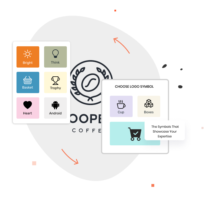
To show that you are an authoritative figure in your field, you need a consulting logo that speaks for your expertise. Include icons and imagery that describe your advisory services with symbols like star, globe, jigsaw puzzle, magnifying glass, torch, brain, shields, eagle, or leaves, etc. Or you can use abstract symbols like swoosh, geometrical shapes, dots, abstract person, arrows, graphs, etc. for your progressive consulting logo. Most firms go with text based logo design with the consultant’s name to put emphasis on authority and personal branding.
Color Palette
Choosing a color palette that resonates with your particular consulting firm and your audience is important too. The colors that work for IT consulting company logos may not be a good fit for financial consulting firm logo designs. As far as colors and meanings are concerned, natural colors like green and blue show trustworthiness, growth, and wealth, good fit for financial advising businesses. Yellow, orange, or red work for IT consulting startups as these colors show optimism and out-of-the-box thinking.

Font Choice
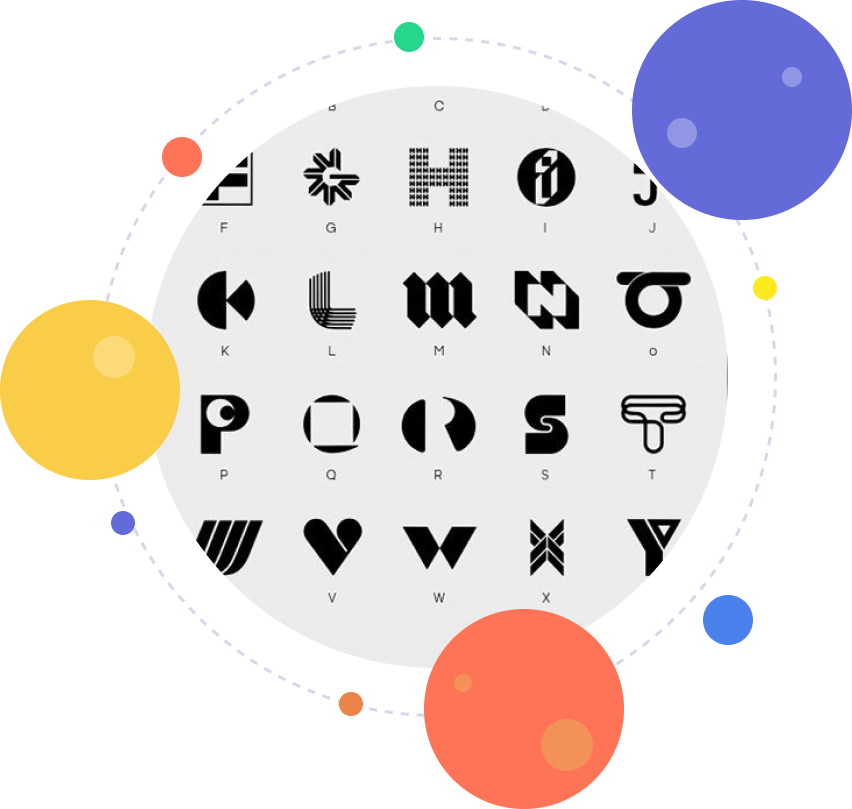
A pro tip for creating a professional logo for your consulting firm is to use font pairing. The most common typefaces used in the advising or consulting industry include Poppins, Avenir, Cormorant Garamond, Marcellus, etc. These fonts work well whether you are in a financial, legal, or marketing consulting business. Stick to one or two of these typefaces in your consulting logo to maintain a professional look. Moreover, avoid using fancy fonts that can deviate your audience from the core message of your brand.

Logo Styles
To design a consulting logo that looks professional on various display sizes like signboards, business cards, website favicons, or social media headers, you need to consider styling. A few popular consulting logo styles include wordmark, lettermark, emblems, mascots, text or symbols inside a shield, abstract symbols, etc. But one of the best ways to make sure you’ve got the right style is to place your company name at the center so the consultation logo symbol stands out from other design elements.
