SALES / SUPPORT : 844-232-4816
Make an Insurance Logo Design


Unique Insurance Logo Designs for Your Company
Make An Insurance Logo For Free

Pick a Logo
Type in your company name or niche keyword and let our AI-powered logo generator present you with tons of insurance logo ideas. Choose an logo template you love and use it as a launch pad for your creativity to take flight! Time to personalize.

Personalize
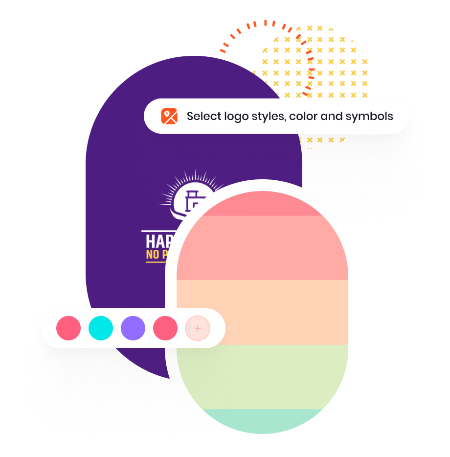
Personalize your design template with colors, fonts, or layouts to make a one-of-a-kind insurance logo. Use our logo creator to play with icons and graphics to make an insurance company logo that looks as professional as your business and builds trust with your audience.
Download
Your stunning insurance logo is ready! To share it with the world, you have to first download your design from the My Design section. You can easily download your logo image in different formats such as PDF, JPEG, and PNG files for easy access and branding.

Start Making Custom Insurance Logos Now!
Professional Insurance Logo Elements

Symbol
Look for the insurance symbols that shed light on your expertise and authority in the insurance industry. You might want to go with different symbols depending on the type of insurance you are selling–health, education, travel, or car insurance logo. Use symbols ranging from traditional icons like hands, shield symbols, red cross, umbrellas, cars, security icons, etc. Or if you are going with an abstract insurance logo, then choose a more modern design or negative space.
Color
The idea is to go with palettes that are relevant to your industry. For your insurance logo, choose lively hues that emit feelings of confidence, protection, and growth. Some common colors used in the are blue to show maturity and trust, green which is associated with abundance and prosperity. Red and yellow give your insurance logo that spark and command attention. Think how you want your clients to feel about your insurance firm, then choose colors based on that.

Fonts
Your company name is the first thing the customers notice when they see your logo, and guess what gives your company name its unique personality–it's the fonts you choose! To give you an idea, some popular fonts for insurance logos are Open Sans, Helvetica, Lato, and Montserrat. A big chunk of insurance companies stick to either Serif fonts if they have been around for a while and to show stability and authority, or Sans-serif which gives a modern or edgy look to your business.

Layout
Your insurance agency logo should look consistent on all print or digital branding. To make that happen, design a minimal insurance logo that is clutter-free. Most common insurance agency logo styles include symbols replacing text, symbols on top of the text, wordmark logos, or combination logos as these layouts are straightforward and don’t overcomplicate your design. Go for a clean insurance logo design that is easy to scale and readable.
