SALES / SUPPORT : 844-232-4816
What Every Restaurant Logo Designer Needs to Know
It’s a universal truth that everyone likes to eat — and what’s more, it’s just one of life’s necessities! So branding a food service company or creating a restaurant logo might seem like an easy prospect.
However, the only thing that people seem to like just as much as eating itself is opening up restaurants to provide food to others. Including both fast food restaurants (“quick service”) and sit-down dining (“full service”), there are more than 660,000 restaurants in operation in the United States alone! There are at least fifteen different types of restaurants, depending on who you ask, and a multitude of different nationalities and regions that contribute their own unique cuisine to the worldwide spread, with everything from the ever-popular Italian restaurant to the more unusual Scandinavian restaurant.
With such a wide variety of elements and inspirations to work with, how can you create the best restaurant logos for an individual eatery?


Here, we have compiled a vast repository of restaurant logo information, including step by step how-tos and inspiration from existing restaurant logo designs. In short, here you have everything that a restaurant logo designer needs to know!
Step By Step Guide To Creating A Restaurant Logo
It’s always a good idea to start with the basics, especially for a process which can be carried out step by step. Logo design is no different.
Creating a great restaurant logo differs in the specifics of the elements you choose, but the overall basis is really no different than creating a logo for any other type of business.
Here are the basic steps to design a perfect logo. After we’ve covered these, we’ll get into the specifics that will give you the information you need to make smart design decisions, based on the type of restaurant you’re designing for.
- Step one: Analyze the restaurant brand, including the type of restaurant, the type of food that will be served, the target market, and the personality behind the brand
- Step two: Conduct market research on potential competitors.
- Step three: Brainstorm ideas and initial designs. Sketching the designs out is always recommended by professional designers.
- Step four: Select a few of your potential designs and develop them further.
- Step five: Get feedback and continue refining until you have a logo that fits the brand and that is approved by the restaurant or brand owner.
These steps look pretty simple, and they can be — especially once you've got the initial phases out of the way. The actual design, ie. using software or a restaurant custom logo designer to create a product, is really the easy part in most cases.
The tricky part is combining all your market research and inspiration into a piece of design, and selecting graphics, colors, fonts, and other elements that work together to create the perfect representation of the restaurant brand. Simply analyzing common, popular, or traditional design elements that are related to the restaurant type can take a serious investment of your time!
But since this is an article about what every restaurant logo designer needs to know, we’ve compiled inspiration and research on individual elements, for popular types of restaurants and types of food. Let’s get into some of the specifics.
Most Popular Type Of Restaurant Logo
There are at least seven major types of logo, though you may count more or less, depending on how you look at it. Ultimately, however, a few of these are most immediately applicable to the restaurant genre.
The more common types of restaurant logo include:
Mascot. This type of logo uses a character as the “face” of the brand. It’s frequently seen in family style or fast food restaurant logos.

Wordmark or lettermark. This is a font-based logo that uses the name or initial letter of the brand as the logo.

Combination mark. This combines two types of logo to create a dual-element logo that can be used in whole or in part. It often includes a symbol, icon, or mascot, along with a wordmark.

You may also find a symbol or icon logo without an attached wordmark, but this is less common. If you do see one, it is usually typically part of a combination mark, with the wordmark portion removed for that particular usage.
Later on, we’ll discuss the top font choices for restaurant logos that include wordmarks or lettermarks. The subject of restaurant logo images and symbols requires a lot more in-depth analysis, however, so let’s tackle that first.
Restaurant Logo Images — Types Of Symbols And Logos And What They Mean
You can design a restaurant graphic logo using a huge variety of styles — from modern, to classic, to futuristic, to pixelated, to simplified, to vintage, to retro logo design and hand-lettering logo.
And the list goes on.
But before you decide on the style that you want to use for your restaurant logo, it’s wise to look at the inspiration behind the graphics themselves. What are some famous restaurant logo images, and why? What symbols are typically used for different types of restaurants? What message do they inherently send?
First of all, let’s break this down into a few basic types of graphic.
- Icon. This is a real-world representation of a real thing. A hamburger icon for a burger restaurant logo is one example; it is a very clear representation of what is found at that location.
- Symbol. This stands for something, and the viewer has to learn what for, rather than it being immediately obvious. A C with a circle around it is a copyright symbol; it does not literally say “copyright,” so you have to learn what it stands for before you understand it. Symbols can represent ideas or values, and they can be abstract, like the Nike swoosh.
Either one of these would make a fine choice for your logo; the importance of choosing goes back to the inspiration behind the logo. The restaurant brand personality may lend itself to a more traditional, obvious iconic approach; or it may be more centered around a free-form personality that allows for symbolic use within the logo design. It just depends on the brand.
If you choose to use a mascot logo, for example, you will automatically be using a symbol. KFC and Colonel Sanders are very closely entwined in the public consciousness, it’s true, and Colonel Sanders is symbolic of KFC — but you do not literally buy Colonel Sanders from the chain that the chicken restaurant logo represents (at least, as far as we know).
Different types of symbols or icons are common for different types of restaurants. Let’s look at some common restaurant logo graphics based on culture and nationality, focus of the menu, and type of restaurant. The inspiration behind these famous logos for existing restaurants will help us to pinpoint restaurant graphics that fit each subset.
Restaurant Logos Based on Type Of Cuisine
First, let’s take a look at restaurants that are based around culture and nationality. This list is by no means comprehensive — here are some statistics that reflect the wide variety and relative popularity of different ethnic cuisine within the United States — but gives a clear idea of the spectrum of available inspirations for individual restaurant brands.

A definite recurring theme within these popular cuisine logos is the use of imagery that is traditionally seen as being linked with that culture or nationality. This leads to certain trends within different subsets, which can make it more difficult to ensure that your restaurant logo design stands out from the crowd. Trends aren’t always bad, but they aren’t always the best thing, either. That’s part of why researching the competition is so vital.
Thai Restaurant Logo
The Sabai Thai restaurant in New York uses a combination mark or wordmark and a simple leaf graphic.
Amarin Thai Restaurant, on the other side of the country, also uses a combination mark with a greenery element.

Another common element for Thai restaurants is an elephant logo, such as seen here for the Thai Elephant in Pismo Beach.

Both of these graphics are common because of how closely they are linked with Thailand — the elephant is a common imagery for the country, and Thai cooking often uses leafy greens such as basil to give the food a distinctive flavor. Another commonality with many Thai restaurant logos is the use of the restaurant name written in both Thai and English.
Japanese Restaurant Logo
Japanese restaurant logos often fall into two types: sushi-specific, and non-sushi-specific.
Sushi restaurants will be discussed in further detail later on, but as you can see from this logo for Samara Sushi, they don’t always include sushi icons.

Japanese restaurant logo designs also tend to focus on nature and typical Japanese imagery, and often use the Japanese writing of the restaurant name in their logo.

Chinese Restaurant Logo
Again, with Asian restaurants, you’ll often find the wordmark written in both the language of the culture and English. Much like Thai restaurant logos, Chinese restaurant logos represent their ethnic cuisine and culture.

Common Chinese imagery, again, is very normal, such as dragons, cherry blossoms, and chopsticks.

Mexican Restaurant Logo
Mexican restaurant logos are often readily identifiable for their use of bright colors, Aztec-inspired fonts and imagery, and the occasional sombrero.

In terms of famous Mexican restaurants, especially of the fast food variety, most would look to Taco Bell. And though the update has changed the look of the symbol logo pretty drastically, the older variation of the design certainly fell into the “typical Mexican restaurant logo colors” category.

Italian Restaurant Logo
Italian restaurant logos are also easy to identify from a long distance away, given how frequently they utilize script fonts for their wordmarks, red or green color palettes, and pasta or green-related imagery for their icons and symbols.
Of course, Olive Garden is a foremost example of a famous Italian restaurant logo, and we can see all of these elements on display.

Indian Restaurant Logo
Indian restaurant logos tend to make use of rich colors and symbols that are centered, almost mandala-like, such as is seen here.

They also may use stylized variants on traditional imagery, such as elephants.

Indian-inspired cuisine, along with similar cuisines, are known for their intriguing use of spices and heat, as is often reflected in the logo. An example can be seen in this Pakistani restaurant logo for Nihari House.

Mediterranean Logo
Mediterranean restaurant logos, including Greek restaurant logos, often use elements like olives and olive leaves, as well as rich colors. They can easily blend in with Italian restaurants for this reason.

American Restaurant Logo
More than any other culture, it seems, American restaurant logos tend to go all-in with their mascots. They’re frequently seen in everything from family style to fast food restaurants.

On the other hand, more refined, upscale dining tends to use sleekly-designed wordmark or combination mark logos, reflecting the nature of the dining experience.

Restaurant Logos Based On Menu Items
Some restaurants get their reputation from being centered around certain menu items. Understandably, that is often reflected in the logo image.
- Seafood restaurant logo — everything seafood might be used in this type of logo. Fish are definitely a popular option, but shrimp logos, seaweed, whales, and nautical imagery such as anchor logos and boats are also common.
- Burger restaurant logo — It’s pretty clear what’s common with this type of place. A burger joint frequently uses a burger-inspired symbol or icon in the logo. French fries or beef logos (like cows) are also typical images.
- Breakfast restaurant logo — This may be more common in the United States, but entire restaurants are built around breakfast menus, which are available all day. Eggs, bacon, pancakes, coffee — not only are all of these available at any time of day or night, they’re also frequently used within the logo design.
- Pizza parlor logo — Pizza parlors often use a pizza-inspired design, whether it’s an actual pie icon or just using polka dots to represent pepperoni in a graphic symbol.


Restaurant Logos By Service Type
Yet more graphic choices come into play when we start looking at different types of restaurants. Not just the food that they serve, not just the nationality or culture they represent, but the actual restaurant style.
Some of these overlap, so we’ll combine some types.
- Catering Service Logo, Chef Service Logo — For a catering logo, the actual imagery that you use will usually depend on the type of food that is included. But some basics include silverware, black and white silhouettes, white-tie, and chef hat.
- Coffee Shop Logo, Cafe Logo, Bistro Logo, Bakery Logo — These types of restaurants often offer the same sort of services, including coffee and baked goods that can be eaten in or taken to-go. A coffee cup or coffee beans logos are popular icons, as well as baked goods like bagel logos.
- Fast Food Restaurant Logo — Again, specific imagery can depend on the type of food, but mascot logos are very popular for this type of restaurant. Another image or symbol that is often seen is the arrow, which represents how quick the service is.
- Cocktail Lounge Logo or Bar Logo, Bar and Grill Logo — Logos for cocktail lounges and bars are often quirky and fun, and frequently based around the name of the restaurant. But common imagery includes beer logos, martini glasses, bottles, and similar silhouettes, which is understandable.
- Health Food Restaurant Logo — Restaurants that center on their healthy food options may be similar to organic farm logos or agricultural logos for food supply chains — they’ll use vegetable logos, greens, leaves, and other similar items to get their point across.
- Supermarket Deli Logo — Not typically included among restaurant types, a supermarket deli nonetheless offers food ready to go, and the logo may fall under the same category as other types of restaurants, such as fast food. So you may find similar imagery, such as arrows; however, many supermarket delis don’t have a dedicated logo, and just use the same logo as the supermarket itself, perhaps with an additional wordmark or tagline.
- Buffet Restaurant Logo, Family Style Restaurant Logo — Buffet and family style restaurants are known for their casual dining, and tend to feature accessible wordmark logos or mascots.
- Food Truck Logo — Food trucks are still rising in popularity, and as more and more unique styles arise in cities across the world, the quirkier and quirkier their logos and branding tend to get. Owners will still often use food truck logos that are based on the type of food they vend, such as discussed earlier.


Fine Dining Restaurant Logo — Often more refined than many other types of restaurant logos, imagery for fine dining is usually quite restrained, and it’s much more common to find a simple, elegant wordmark.
Sushi Restaurant — Sushi logos may use cute, stylized sushi imagery, or they often also use sushi ingredients, such as the stylized fish used in this logo for Soichi Sushi.

Choosing Colors For Your Restaurant Logo Design
As you look through the restaurant logo design inspiration that has been included thus far, you may have noticed that primary colors, especially reds and greens, are very popular
.
There’s a reason for this, and it ties back into the psychology of color for logo designs. Color usage affects us in different ways.
There are the colors that are inherently tied to certain objects, genres, or experiences, due to our culture and background. For instance, organic or “healthy” brands often use green, because that color is closely linked to nature.

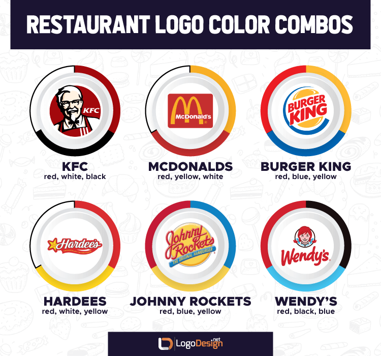
Another very popular color option for restaurant logos and branding is red. Red is the most dynamic, active color, and as such, it can be the most motivational. It catches attention, it creates an impact, and it may even stimulate the appetite! All of these factors play into the common usage of red for restaurant logo design.

However, again, the colors that you choose will be dictated by:
- The type of restaurant
- cultural considerations
- The competition
- Brand personality
- What “feels right”
All of these are impossible to know ahead of time. You may have an idea of what colors you want to use in your design, but be open to change if the circumstances call for it.
Top Font Suggestions For Restaurant Logo Design
Wordmark or combination mark logos are incredibly popular within restaurant branding, for the simple reason that they are the most straightforward and easy to remember. Restaurants have a lot of competition, so they need to make the most impact in the shortest amount of time. Font-based logos help brands to do just that.
There are a few different ways that you can choose a font — keeping in mind that the psychology of fonts is also an intriguing field of research that may impact your choice.
- Choosing fonts based on ethnicity of food. As was made clear earlier, many restaurants that are specifically dedicated to a certain cultural cuisine often include the name of the restaurant both in English and in the language native to the culture. On the other hand, some restaurant logos simply choose to stick to English, but choose a logo that reflects the aesthetics of the language. This font called Gang of Three is a great example of how that might work for a Chinese restaurant.
- Choosing fonts based on type of food. This choice really goes back to how you combine elements within the logo; for example, using a stylized food product as part of the font, and designing a font to match. A fun example is the Chili’s logo.
- Choosing fonts based on type of restaurant. Certain fonts just naturally lend themselves to certain types of logos, and what’s great is that you can search for ideal fonts based on genre. For example, if you’re looking for a cafe logo or coffee shop logo font, this list here at FontSpace includes a range of different font faces that are perfect for cafe logos. You can also look for other categories of restaurant, as well.

While the most popular type of font depends on the type of restaurant, a quick overview of some of the most popular restaurant logos will show that food services is one industry that doesn’t shy away from script fonts. Script is usually seen as more creative and quirky, and can be a risky move in terms of branding, simply because it might be a bit more difficult to read. But cursive fonts and script fonts are frequently found in restaurant logos, so don’t hold back if it fits the brand.
Creating The Ideal Logo For A Restaurant Brand
Restaurant logo designs offer a wide world of options, giving logo makers and designers the chance to embrace their creativity and really make the brand shine through the logo. There are fewer taboos than in many professional markets, and research into the competition is relatively easy to conduct.
All in all, while the proof of the restaurant brand will be in the food they provide, it isn’t a difficult task to design a logo that fits the company. Just make sure to stay true to the brand personality, take trends with a grain of salt, and always aim for "unique."
Reviewed by Zaheer Dodhia, CEO and Founder LogoDesign.Net
