SALES / SUPPORT : 844-232-4816
How to Design Impactful Visuals
For Social Media
MIT Sloan Management Review states, “Nearly 60% of all digital impressions are driven by images.”
Every time you open your favorite social media app and are dazzled by all the new graphics, illustrations, and reels, that isn’t by accident. Businesses know we like attractive graphics and they give us more of it.
But we are a discerning clientele. We don’t like all social media graphics, only the best. As a business, your job is to assess what social media graphics work with your target market and how to use them to get people talking about your brand.
In this post, we cover social media graphics at length. Including types and the social media marketing metrics they impact. Once over with fundamentals, we dedicate the major chunk of the post to 8 design tips that help you master social media graphics with ease.
The Importance of Stunning Graphics on Social Media
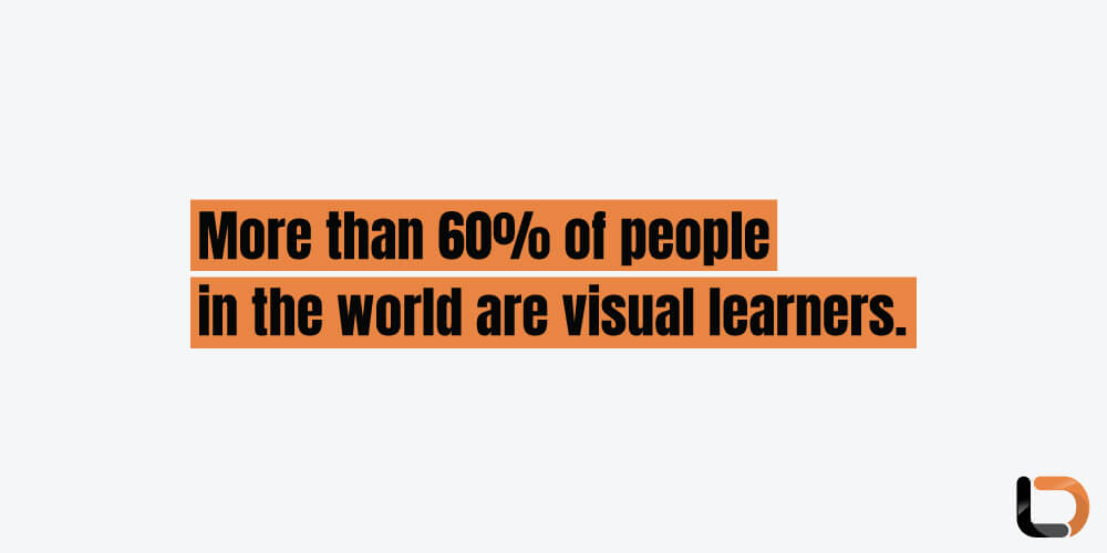
More than 60% of people in the world are visual learners. This has helped social media explode on the scene like no other recent technology. Even in corners of the world where people may not know how to read or write, social media is their primary platform for entertainment, learning, education, social participation, and more.
Whether you are a business providing goods or services or a politician running for a presidential campaign, social media has become your main tool to connect with your target audience and communicate your message.
How effectively you do that may have something to do with your visual content strategy. If your graphics are well-made and hi-res, if the design elements are consistent, if they resonate with your target market and align with your brand values, and if your post schedule is steady, you may break through the bubble and influence social media algorithms to find your place within your intended communities.
Top Stats: Visuals and Social Media Metrics
Talk is good but numbers are better. What do the numbers say about strong visuals and their impact on social media?
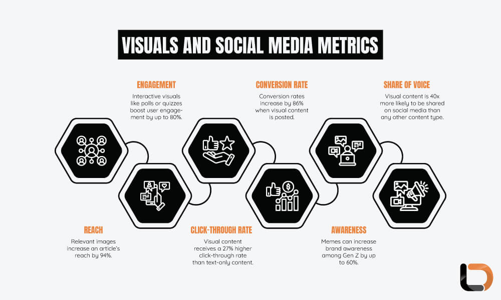
Types of Social Media Visuals
Not only do we seek variety in life, but we want it on our social media feed too. Diversified visual content caters to a diverse audience and helps a brand tell its stories better. Different templates for different tales, right?
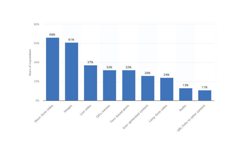
Here are the 4 main categories of visual content on social media.
- Photos
Photos can be divided into multiple subcategories. Original photographs of a person, a brand, or a product, BTS photos, and quotation graphics are popular image types under this category. Branded photography like your social media profile or social media header are all critical visuals to get right.
- Videos
Videos have emerged as the strongest form of visual content on social media. TikTok has spearheaded this movement but YouTube was the pioneer. Marketers consider both live-action and animated video content to be highly effective tools for brands looking to boost recognition and drive growth.
- Illustrations
Digital representations of people and objects are known as illustrations. These creative content types are popular among brands and help brands when original photography isn’t easily accessible or the right tool to employ.
- Infographics
Charts, graphs, and infographics are great mediums of storytelling and communication. Whether you want to explain a concept, highlight the scope of an issue, or narrate a tale, create infographics as strong tools to carry the brand message forward.
Tips to Design Impactful Visuals for Social Media
How do you get social media graphics right? Here are the best design tips for ensuring your social media graphics always hit the mark when you click ‘post’.
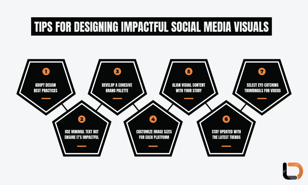
1. Master the design best practices
First of all, master the basics. These include:
- Branding:
Place your logo design on everything you post. Be it an image, a picture, a video, or a chart. This helps people know where the image came from and makes it easy for them to find you online
- Hierarchy:
Arrange elements on the layout in order of importance. Headings must be boldest and largest. Subtext smaller, and body text even more so. Hierarchy helps guide the eye and aids reading and comprehension.
- Clarity:
Practice ‘less is more’ in your visual content design so you only include elements and information that drive your point home.
- Production quality:
Create high-resolution graphics tailored to each platform to optimize their brand value.
- Negative space:
Social media is rife with visuals. Abundant negative space in your visual content will emphasize your key message and help break through the visual noise on social media.
- Contrast:
Contrast in background and foreground elements is critical for reading and comprehension.
Once your graphics continually attain this minimal design standard, you can flesh out a proper visual marketing strategy and move on to the next steps.
2. Create a brand palette
Consistency is key in design and marketing. Create a brand palette that follows your brand’s design guidelines consistently. Your brand palette should include design instructions on:
- The brand’s visual tone and style
By incorporating colors, fonts, and visual styles consistently across all your social media visuals, you can promote a cohesive brand and build trust with your audience.
3. Match the visual content type with the story
What brand story you’re going to tell with this post? Different graphics complement different brand moments. If you are announcing an accomplishment, an original photograph is the best. To explain a concept, infographics are ideal. To share a funny story, go with a meme.
Choose the visual content type that gives your brand story the strongest wings to fly with. And keep it fluid. Experiment with different content types and see what works best. You might even realize that memes sometimes work better even when the news isn’t funny. Or that illustrations are cool when used with a relevant quote.
Keep it moving and build on what works best.
4. Choose eye-catching thumbnails for videos
To ensure people click on your videos, select an enticing thumbnail. You can select a frame from the video as the thumbnail or choose a custom graphic. Either way, your aim should be to convey the main idea of the video through the thumbnail so people know what it’s about and be willing to watch it.
5. Use minimal text but maximize its power
Make minimal use of text in your visual content and use it to its maximum advantage. There are three ways text can supplement your visual content on social media.
- Alt-text:
Alt text is alternative text that describes the visual content. It helps search engines plus users with visual disabilities to engage with the visual content and understand it better.
- Captions:
Add captions with your visual content to help explain it further or introduce a different angle. Captions are especially necessary as 75% of online users watch videos on mute.
- Transcripts:
Transcripts take captioning a step further. They include textual descriptions of all sounds in the videos, including background noise, special sound effects, and more. Transcripts are more enriching than captions for viewers with visual disabilities.
Remember to maximize the power of all the text content you use but use it only minimally and strategically.
6. Customize image size for each platform
All social media platforms use different image size specifications. An image that’s sized for an Instagram post will not work on Facebook. The vertical video format of TikTok is not suitable for social media. And the pattern remains true for all these services.
Therefore, remember to get the sizes right. Here’s a handy guide that Hootsuite did.
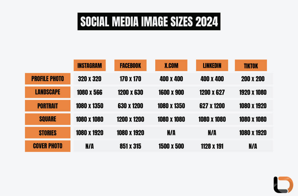
Remember to stay updated with this information as the sizes may change following design changes within platforms.
7. Keep pace with the hottest trends
Social media is an ever-changing landscape of the newest trends. To keep your brand strategy fresh and exciting you must know what the audience is talking about and what other brands are doing. Then hop on to the wagon by fully claiming what you’re doing or putting your own twist to it to position your brand as original and bold.
Lastly, publish your content when your audience is up
One of the most impactful visual content strategies is to post your content when your customers are most receptive to it. Visit your analytics page to find out when your audience is most active. If you are a global brand, some of your user pockets will be more active at certain times than others.
Spread out your publishing schedule to take those time disparities in mind and ensure your brand is never asleep when some of its fans are up and awake. By always remaining front and center of your audience, you’ll create a stronger affinity with them and be their go-to whenever they have a relevant choice to make.
