SALES / SUPPORT : 844-232-4816
15 Graphic Design Trends You Can No Longer Ignore
In this day and age, the graphic design industry is changing very quickly. If you think about it, visual elements have a huge role to play in the success of a business today. Attractive imagery, icons, and symbols can tell people about the value, customer experience, and expertise of a brand. Now, every year, there are new trends and developments in graphic design that you need to follow closely. This can help you incorporate visual elements within your digital and print branding strategy.
When it comes to graphic design, you need to be aware of the latest logo trends as well as trends websites and other mediums. While most experts recommend that you should avoid following all the new ones, it’s a good idea to know what’s going on in the industry. To this end, this can help you connect with potential customers and build a recognizable brand as well. To make this easier for you, here are some of the most popular graphic design trends you can no longer ignore.
Logo Design Trends 2023
A logo is usually the first thing that people notice about a business or brand. It appears on product packaging, merchandise, website, and social media pages. The icon or symbol is an important part of graphic design and can influence how people perceive a product or service. With an appealing and memorable logo design, you will find it easier to create a name in your industry and stand out among the competition.
Before we start discussing the latest graphic design trends for logos, let’s talk about why they are important for both designers and business owners. If you think about it, the graphic design industry has changed significantly with the progress of technology. The transformation has allowed small business owners and startups to reach out to their target audience quickly and compete with established brands.
To design a modern logo, it’s important to know about the trends. Let’s take a look at a few that you should no longer ignore.
- Alphabets Logos
- Attorney Law Firm Logos
- Employment Hr Logos
- Architecture Firm Logos
- Bakery Logos
- Barber Logos
- Clothing Logos
- Nurse Logos
- Auditing Logos
Creative Typography
It's one logo design trend that can be seen in a lot of logos this year as well. Brands are experimental and creative with typography in different designs. If you are thinking about creating a font-based logo, then you can take inspiration from this trend. Disappearing or overlapping letters can add to the appeal of wordmarks or lettermark. You can also include a glitching effect to the text or waves to show motion.

Source: underconsideration.com
Use custom font styles to make an impact on the viewer instantly. With creative typographic logos, you can keep the design minimalistic and also make it appear trendy. You can also choose modern and clear-cut fonts for the wordmark or initials. The symbol could stand out for its effects or color tones.
Objects in Letters
This is another trend that you need to keep in mind when designing a modern logo. Adding an object or shape within a letter can make it easier for people to identify the symbol and differentiate it from the competitors too. Logo designers are taking the opportunity to express their creativity by merging shapes with various letters. You can also include this within a lettermark to create a unique logo design that grabs the attention of viewers instantly.

Source: underconsideration.com
Circular shapes or geometric ones can be used to convey a strong brand message. With this trend, you can get a simple logo that looks professional and lasts for a long time too. Today, you may come across quite a few logos in the eCommerce, tech, and finance industries.
Black and White Logos
It’s a classic and timeless logo design trend that has become dominant in logos too. Black and white icons require minimal upgrades over the years and can be easily used on various digital and print mediums. If you take the example of logos in the fashion industry, you will find that many brands have moved toward this trend. From Nike to Chanel, most brands have chosen black-and-white designs to build recognition and make a positive impression on the audience across the globe.

Source: underconsideration.com
While this is not exactly a new trend, it can no longer be ignored. When you are brainstorming ideas for your logo, create a draft or variation in black and white first. This will give you an idea of how the icon might appear in those colors. If they are relevant to the niche or industry and can highlight the core values of the brand, then you should create a timeless logo in black and white.
Nature-Inspired Designs
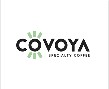
Symbols that are inspired by nature are considered very trendy. Leaves, flowers, abstract patterns, or illustrations that remind people of nature can make a logo quite appealing. Now, these icons can work well in environment logos, educational, chemical, beauty, and religious logo designs. Nature-inspired icons can send a positive message to the viewer and bring out feelings of joy or happiness too. You can also choose to create such a design with soothing and subtle colors that remind people of a garden or beach.
Source: underconsideration.com
Hues of blues, greens, and earthy browns can make a lasting impression on the viewers. Logos that have natural elements also tell people about the brand’s association with a good cause. For instance, trees or leaves can show that a business is eco-friendly or is involved in protecting the environment. This logo design trend makes it easier for brands to connect with a younger demographic of consumers as well.
- Jewelry Gemstones Logos
- Religion Spirituality Logos
- Information Technology Logos
- Private Investigator Logos
- Japanese Restaurant Logos
- Cardiology Logos
- Aviation Airport Logos
- Startup Logos
- Gift Shop Logos
Blended Gradients
This is one element that is becoming quite popular in logos recently. When Instagram introduced its gradient logo a few years back, it generated a lot of interest among graphic designers and the audience. Gradients can make a logo stand out in the industry easily and stay in memory too. But with this trend, you need to consider some other factors as well. Gradients might not be relevant for every industry or niche. They could confuse clients or customers that are looking to build long-term relationships with businesses in finance for example.

Source: underconsideration.com
SaaS businesses could consider gradients in their logos to get the attention of their target audience. The color tones can catch the eye of visitors on a website immediately and create familiarity across other digital mediums too. If you are looking to launch an eCommerce app, you can also consider using gradients for the icon.
Website Design Trends 2023
Regarding web design trends, it's essential to keep track of the colors, fonts, and images that can get people interested. Now, these change every year as designers look for the next big thing in their field. So you should be familiar with the elements to include in your business website or eCommerce platform. Before working on a website, it’s a good idea to look at competitor ones so you can get an insight into what similar businesses have done.
This could also help you with research and make it easier to understand how to connect with your audience in a short time. Once you are clear about that, you can look for a website builder to create your platform. Let’s discuss a few web design trends that you can no longer ignore.
Large Animations
If you think about it, the competition in the digital world is getting tougher every day. To grab the attention of consumers before other businesses, you need to make an impact with web design. Since a lot of brands have attractive websites, you need to engage visitors with an interactive platform and good user experience. This is where a large animation or dynamic visuals can play a huge role.
You can include this above the fold to show how your product works or to give people an insight into the brand. The animations can be interactive with a ‘scroll down’ option so visitors explore the website and find out more information.
Geometric Designs
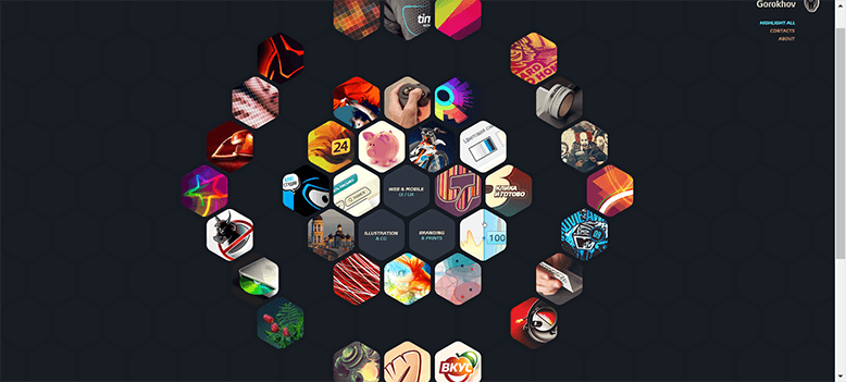
The trend of adding geometric shapes within a website layout may not be new but it’s certainly dominant in the industry. They can be used in many ways to create a minimalist and clean appearance. You may see a few websites incorporating geometric shapes such as rectangles and squares to highlight important information on the home page. It's a good way to draw attention to relevant details and break up chunks of text too.
Source: http://gorohov.name
You can also opt for borders to make the visuals stand out on landing pages and increase white space within the layout. Shapes can work well in various web designs and send a strong message to the viewers as well.
- Website Builder
- Logo Contest
- QR Code Generator
- Orthodontist Logos
- Catering Logos
- Warehouse Logos
- Pediatric Logos
- Day Spa Logos
- Florist Logos
Minimalist Layouts
This is a web design trend that has been followed by designers for quite a long time now. It's likely to stay in the coming years too. Minimalism means that people expect to see fewer elements in logo design or website. For websites, this is one factor that should be kept in mind. Today, many people access various platforms on their smartphones or tablets. If a page has a lot of large images or video files, it may take a long time to load. This could lead to visitors leaving the website quickly.

Source: https://mowellens.com
To avoid such a situation, you need to design minimalist layouts that have ample white space and only relevant information and visuals. Websites that have fewer elements can engage people immediately and keep people on the page for minutes.
3D Images
Many SaaS website designers are using 3D images to showcase their product or solution in the best way. It can help people get an insight into the technology and make the right purchasing decision as well. 3D images can cover the area above the fold and be used as large headers too. You can also include them within a landing page to explain how it works. With such imagery, it's important to consider different mediums or devices too.

Source: https://maze.co
This is mainly because 3D visuals can impact the loading speed of the website. Make sure that you optimize the graphics for smaller screens and resolutions. The trend of using 3D images is certainly here to stay. It makes it easier for designers to create interactive and easy-to-navigate websites that can convince people to checkout with the product at the end.
Hero Video
This is another popular trend that might last for the coming years. Hero images can feature bold headlines that tell people about a product or service. It can also include CTAs so visitors can act immediately and signup or get a free trial. They allow people to understand what a business or brand has to offer and connect with the message as well. If you want to go with something different, you can incorporate a large video in the section above the fold.
It could work as a hero element on the website and grab the attention of visitors. With a hero image or video, you can keep the home page minimalist and only add informative text that introduces a product or solution.
Brand Identity Design Trends 2023
These are all promotional materials or platforms that can help you build your brand. Stationery, business and visiting cards, envelopes, and letterhead designs are important for creating awareness and maintaining consistency. They can also help you align internal and external branding strategies. So you need to focus on trends in brand identity designs to market and promote your business in the best way possible.
Bold Colors
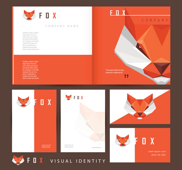
This is a trend that you may see on flyer designs, letterhead designs, and envelope designs as well. Bold colors can instantly catch the eye of a viewer and encourage them to check out what the business has to offer. They can be added to letterhead templates for instance to make the design prominent and appealing. With such colors, you need to make sure that they represent your brand and do not confuse the audience.
Source: istock.com
You can take inspiration from the logo colors or a similar scheme to create business cards or envelope designs that boost recognition. It is a good idea to consider your options carefully and create brand identity designs that require minimal upgrades over time.
- Business Card
- Promotional Products
- Letterhead Design
- RV Logos
- Homeopathy Logos
- Seafood Logos
- Yoga Logos
- Vocational School Logos
- Translator Logos
Illustrative Designs
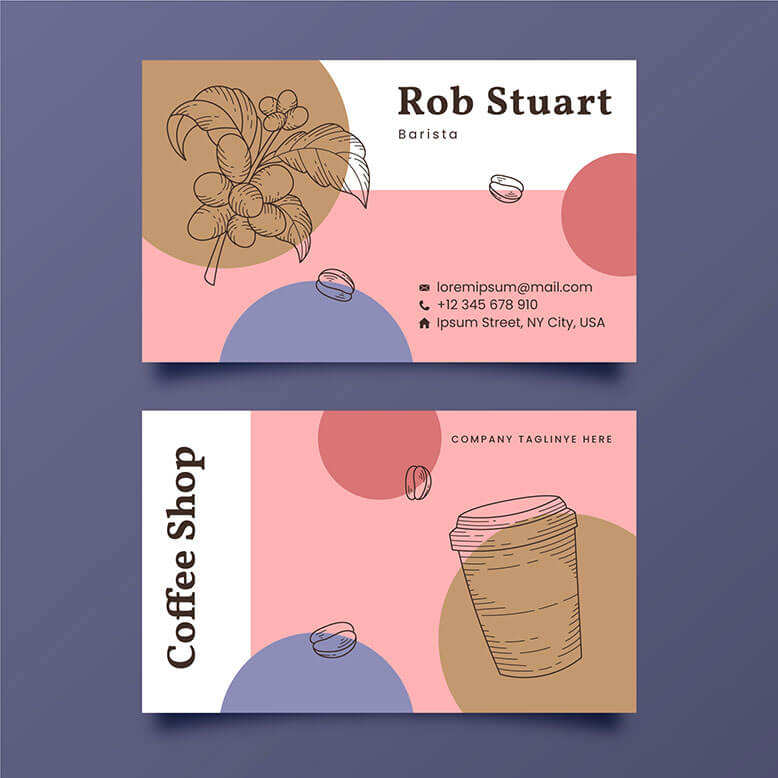
You can always choose illustrative designs for branding materials. This is a good way to stand out among the competition and make a memorable impression on the target audience. Most businesses and designers pick minimalist and modern elements which can be added to templates for stationery design or visiting card design. Look for imagery or illustrations that are relevant to the business and brand.
Source: freepik.com
Make sure that you place it in a way that does not overwhelm the logo or company name. For letterhead designs, illustrative images or patterns can be added at the end so there is ample white space above. Most online tools offer templates for brand identity designs that you can browse through and customize as well.
Patterns
It is a popular trend in brand identity designs that you can incorporate within various promotional materials. Abstract patterns or shapes can make people notice envelopes or stationery immediately. They also appear modern and are easily found in templates too. So you can incorporate them into various designs and change the color or placement accordingly.

Source: dribbble.com
Geometric patterns are commonly seen on letterhead designs and business cards. You could opt for such elements on business cards or envelope designs to create familiarity among new customers. They can also make a good impression on viewers as patterns allow them to focus on relevant information and recognize the branding elements too.
Serif Fonts
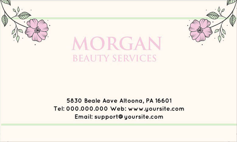
Elegant font styles are always a good idea for stationery and letterheads. If you think about it, serif fonts send out a strong message and look sophisticated as well. You can also choose clear-cut and modern San Serif styles according to the brand guidelines. For headlines, titles, or company details, you can use elegant typefaces. This may convince people to look up the website or store to check out the products.
Source: LogoDesign.Net
Before you get anything printed, look at how the fonts appear on various promotional materials. You can also consider feedback from your team or a focus group of consumers. This will make it easier to choose the right font styles for trendy brand identity designs. You can also maintain consistency and generate interest among the target audience.
Letters Merged With Images
For designing posters, brochures, or flyers, you could take inspiration from this graphic design trend. Large images can include letters on or across them that do not overwhelm or confuse the viewer. You can highlight the company name or a social message on product pictures or visuals that are associated with your brand. Sometimes, a shape like a square or a circle can have overlapping letters on it.

Source: Behance
When you are designing a template for letterhead or business cards, you could include letters on images that create a contrast with colors. This could make it easier for you to draw the attention of the audience instantly. You can be as creative as possible with this trend and place the brand name, tagline, or just a heading in different ways on imagery.
Conclusion
These are some of the graphic design trends that you can no longer ignore. If you are looking to get started with your branding strategy, then begin brainstorming ideas for your logo and web design first. You can find a website creator to set up a business page or eCommerce platform. For brand identity designs, take a look at some of the templates that match your requirements and start customizing them to generate letterheads and stationery.
- Party Rentals Logos
- Laundry Logos
- Cemetery Logos
- Beauty Salon Logos
- Collision Center Logos
- Auto Shop Logos
- Rent a car Logos
- Veterinary Logos
- Graphic Design Trends
