The rules of color are changing. Does your logo still scream 2008? If so, it’s time for a glow-up. Let these trends help you pick a palette that pops.
In 2025, logo color trends will no longer be driven solely by aesthetics. Data, psychology, cultural relevance, and digital-first approaches influence them. Some of the most attractive logos today don’t just look good; they communicate a message and build trust.
This year’s color shifts reflect broader changes in consumer behavior. A move toward authenticity, environmental consciousness, and emotional clarity. When choosing a color palette for your brand, it’s important to consider such factors.
To make it easier for you to select a timeless combination, let’s explore what’s in, what’s out, and why it matters. This could help you use color not just to keep up with trends, but to stay ahead of them.
What’s In: Top Color Trends in Logo Design
In 2025, brands are most likely moving toward palettes that reflect values such as sustainability or innovation. And they leverage both color psychology and perceptions to make the right choice. From earthy tones that show eco-friendliness to bold digital hues that capture attention in virtual spaces, these are the colors defining modern brand identities.
1. Earthy and Nature-Centric Colors
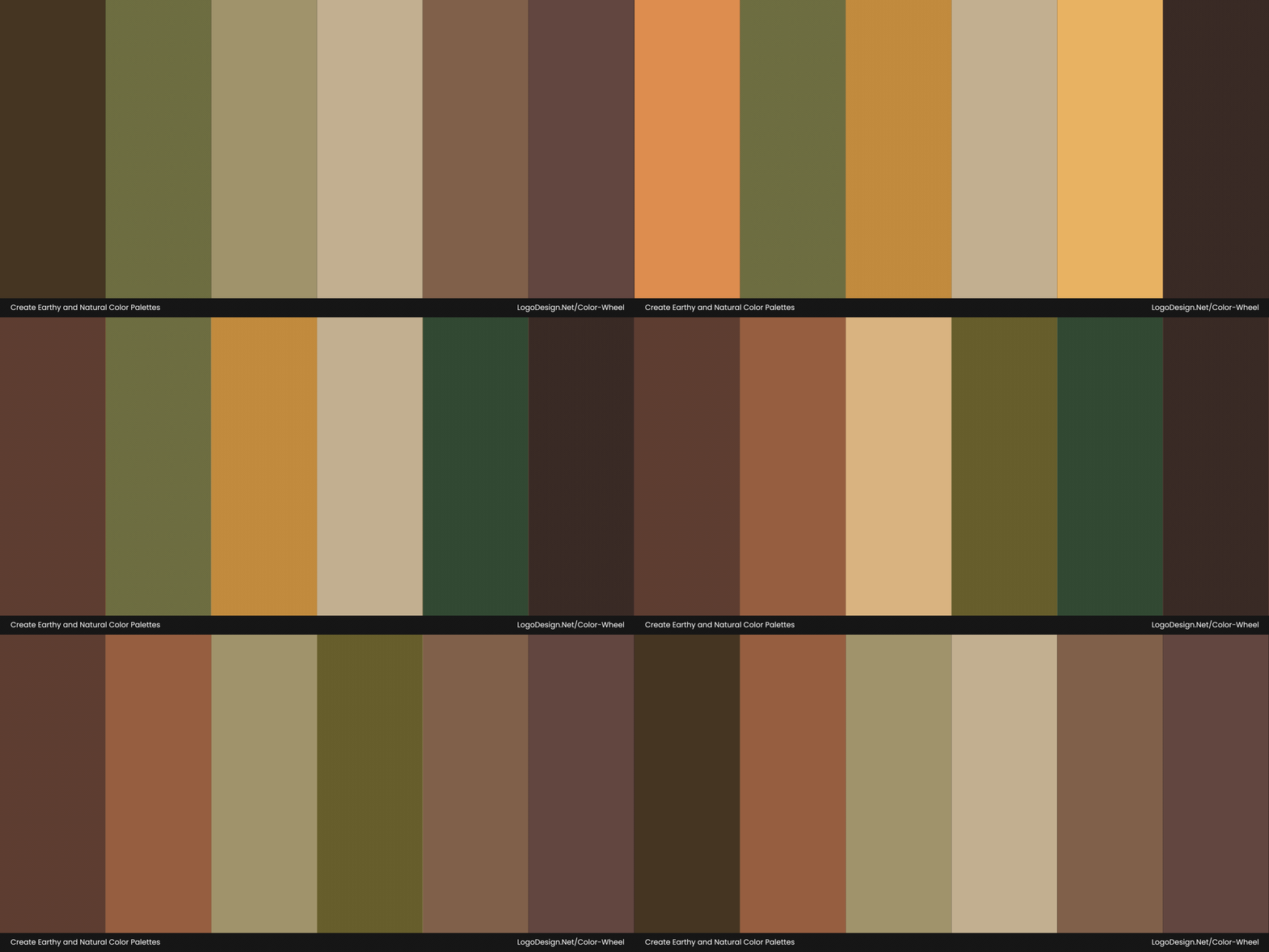
Dynamically changing image showing earthy and natural colors.
Moss green, terracotta, clay beige, deep forest, and muted tones are quite popular right now. A palette that feels grounded, calm, and real can make an impact within seconds. If such colors are industry-relevant, then the choice becomes ever simpler. But you do have to consider factors like your product/service and brand message too.
Common in Wellness, Outdoor, and Eco-Product Branding
Earthy tones suggest balance, intention, and a connection to the natural world. When it comes to color theory in logo design, such colors are all nature-centric. Moss green, for instance, is associated with growth and restoration.
These colors are a good choice for wellness and skincare brands, sustainable fashion logos, organic vegan companies, and outdoor fitness lines. The visuals don’t just look natural, they also reinforce a brand’s commitment to sustainability.
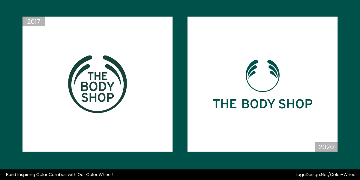
The Body Shop logo transitioned to a softer green hue in 2017, suggesting a connection with nature and eco-friendly practices. The clean typography, combined with a rich forest green, also evokes a sense of environmental responsibility and sustainability.
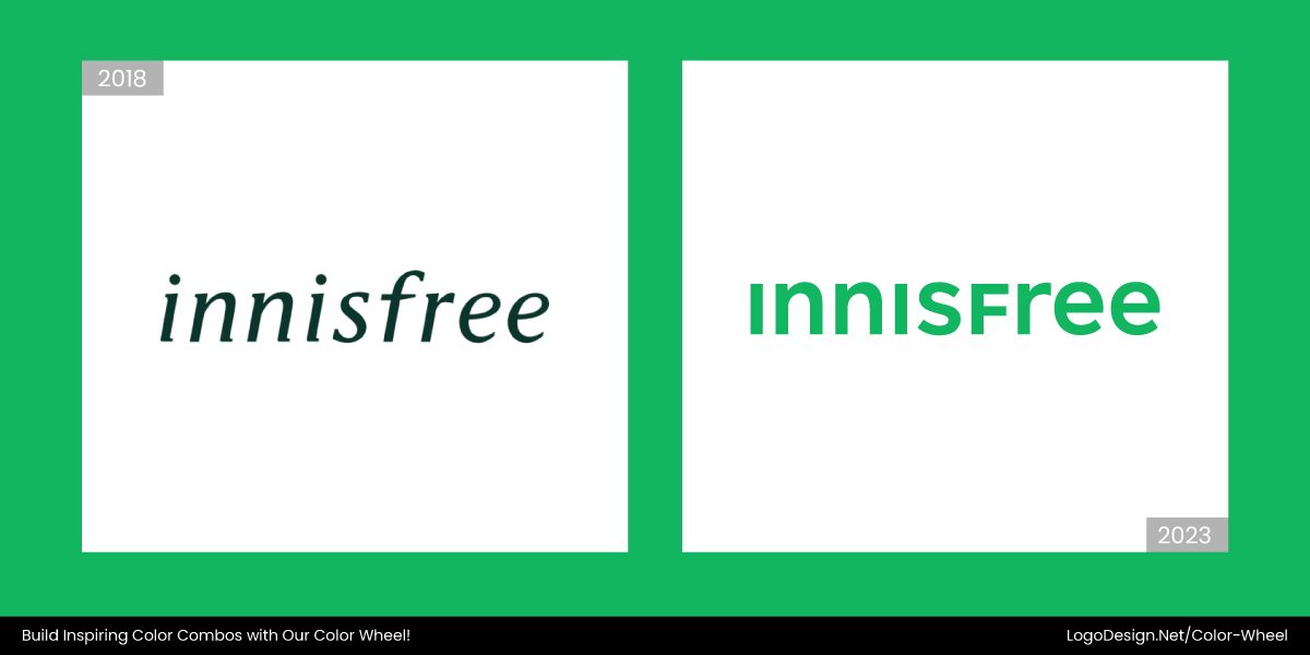
Having changed its logo in 2023, going from a deep green wordmark to a light green, Innifree’s logo has a minimalist, gentle, and nature-friendly theme, shaping its visual identity to attract eco-conscious consumers.
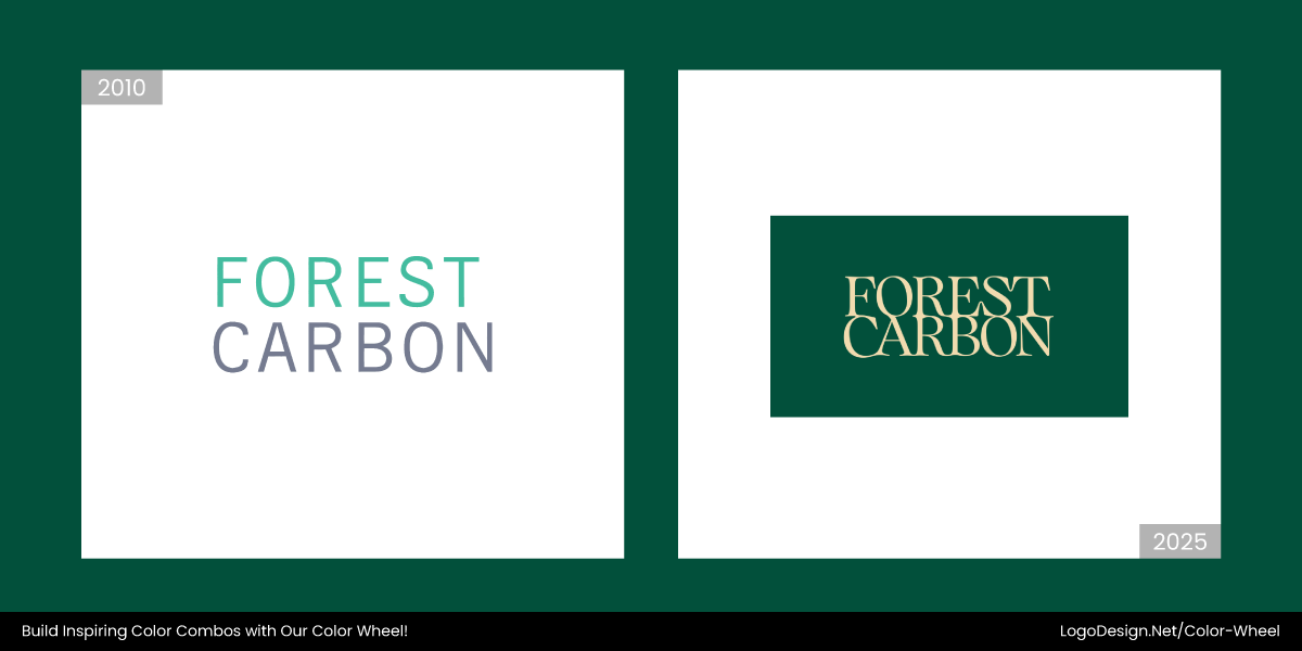
In early 2025, Forest Carbon changed its logo from dull-looking and random to one with a green background and fonts resembling tree roots, matching its brand value of caring for forests.
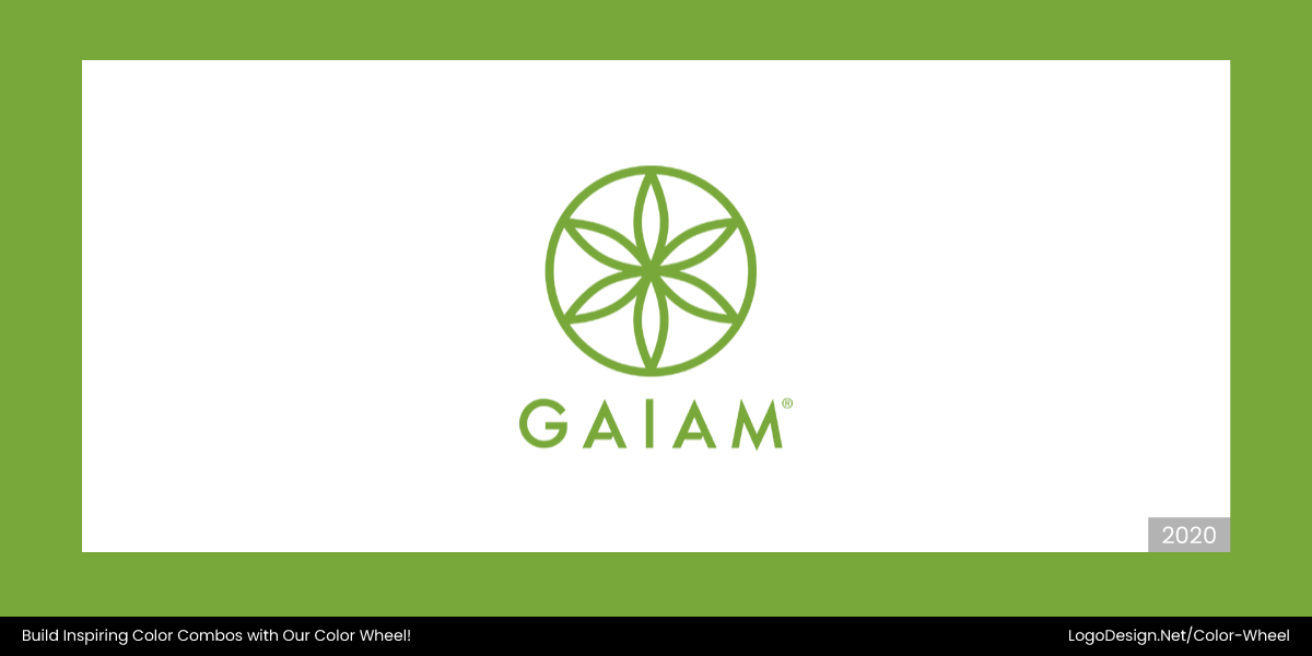
GAIAM’s logo shows a connection between nature and spiritual balance. It has a green background and a stylized flower-like symbol. The organic geometry and clean typography also emphasize love for the planet.
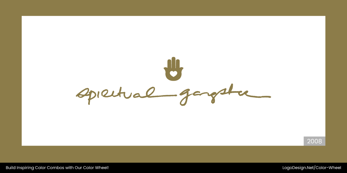
The Spiritual Gangster logo features handwritten typography in a light brown, earthy color, accompanied by a symbolic Hamsa hand with a heart, conveying a message of spiritual love and ancient wisdom.
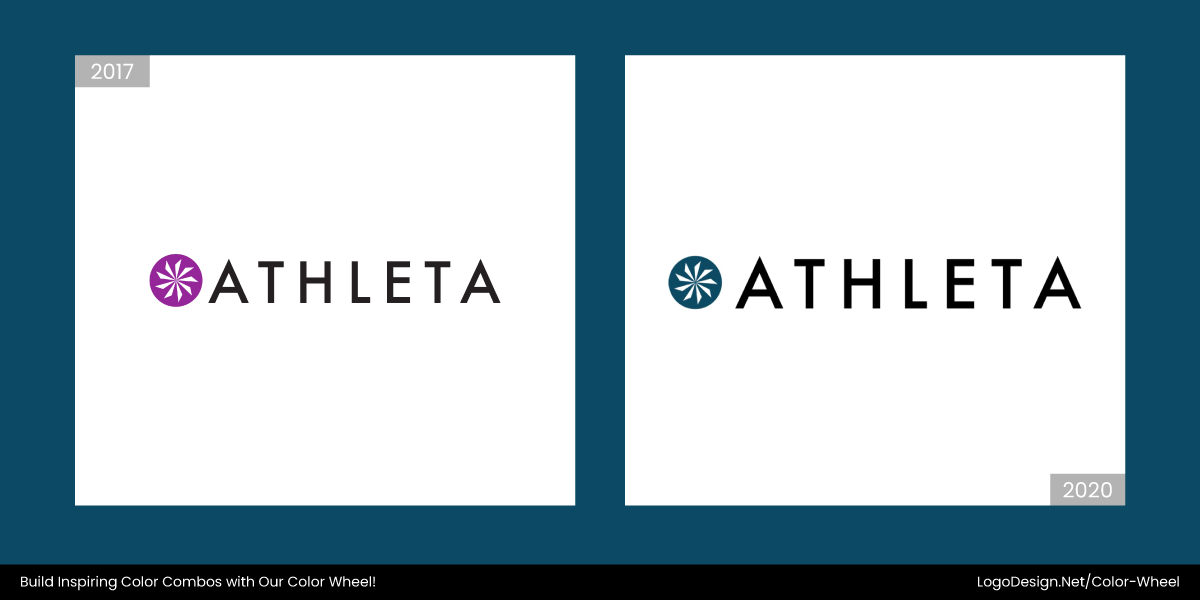
Founded in 1998, Athleta Well rebranded itself after being acquired by Gap in 2009. The logo changed to a nine-petaled white flower. The flower represents feminine energy, the no. 9 shows energy, and the white color suggests natural clothing.
2. Softer Digital-First Hues and Pastels
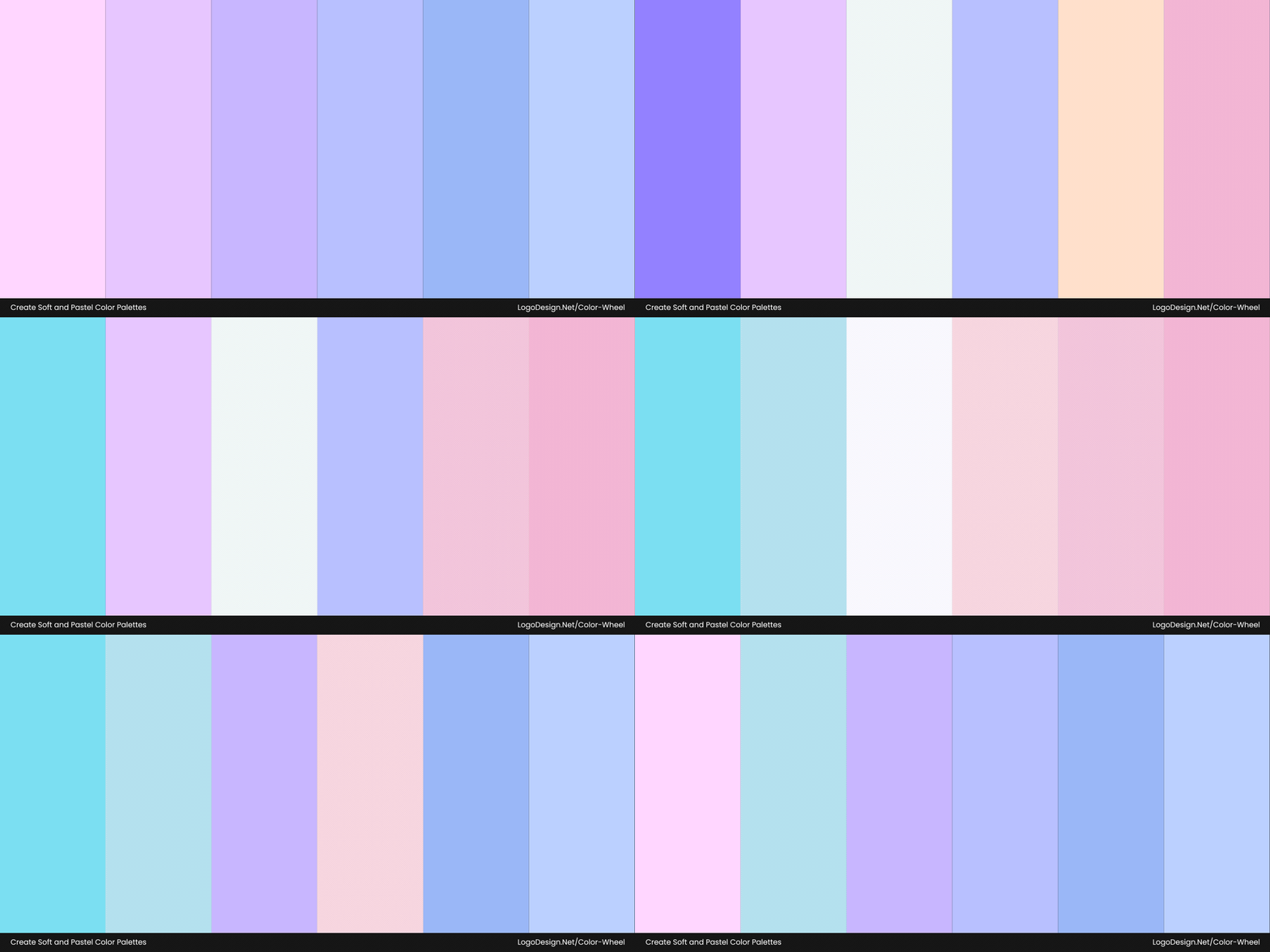
Watch the different soft hues and pastels used in logos.
Think of colors like sky blue, blush pink, pale mint, and soft peach here. They are being chosen by brands in 2025 as they show innovation with approachability. These hues represent a balance between the future and the familiar, clean, calming, and quietly optimistic.
Common in Tech and Healthcare Branding
You’ll see these hues increasingly used by healthcare startups and fintech brands looking to appear more transparent and user-focused. The palette communicates clarity, care, and accessibility, making complex digital products feel more approachable.
Kindlife’s updated logo uses soft hues, pastel tones, and Kiki (the brand’s mascot), incorporating a Korean heart. The revamp illustrates the brand’s gentle tone and showcases its value as a clean-label wellness platform.
The Parsley Health logo uses a clean, soft color palette with mint green, suggesting neutrality and care. The low-saturation hues in the logo represent wellness and trust.
With a soft green-toned background and rounded typography, Elvie‘s logo conveys a sense of harmony and growth. The minimalist design aligns with human-centric values of women’s health tech.
In early 2025, the Indigenous Pact moved from bold tones to a softer, pastel palette with purple as its primary color. The logo draws inspiration from the native star quilt, a traditional symbol in Native American cultures.
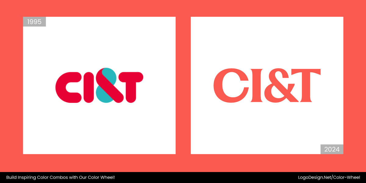
In August 2024, CI&T revamped its logo from a vibrant turquoise palette to a softer coral tone with a range of digital-first pastel hues. Combined with cleaner typography, the logo shows global adaptability.
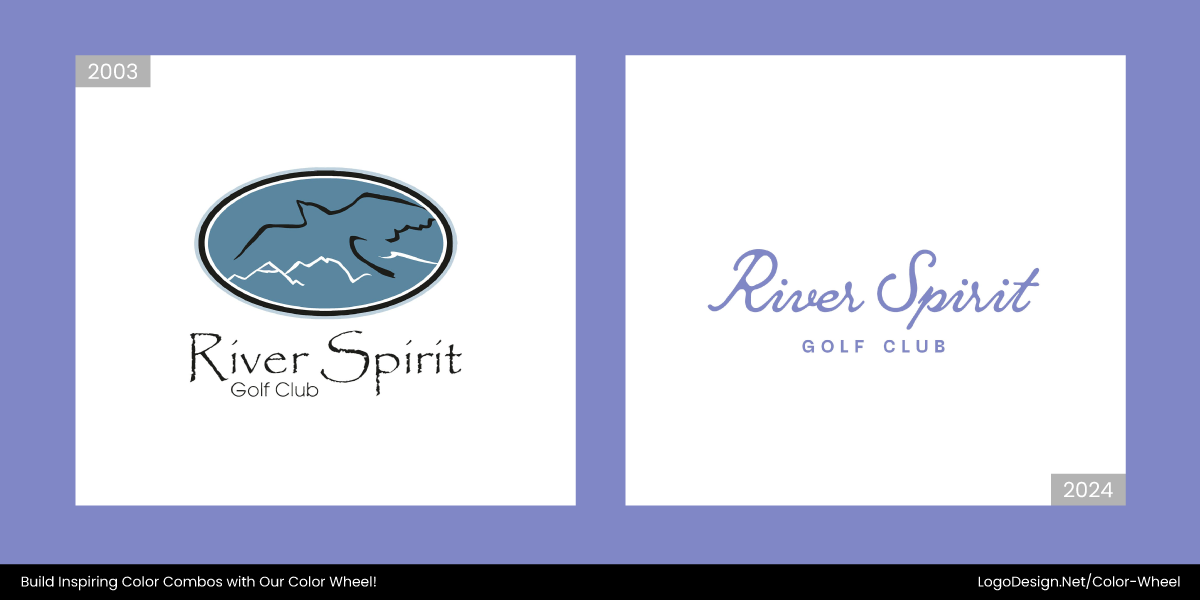
The new River Spirit logo went from a heavy blue and black color to a soft lavender hue in early 2024. The new palette evokes calmness and relaxation, resonating with the club’s rich tradition and modern sensibility.
3. Hyper-Gradient Spectrums
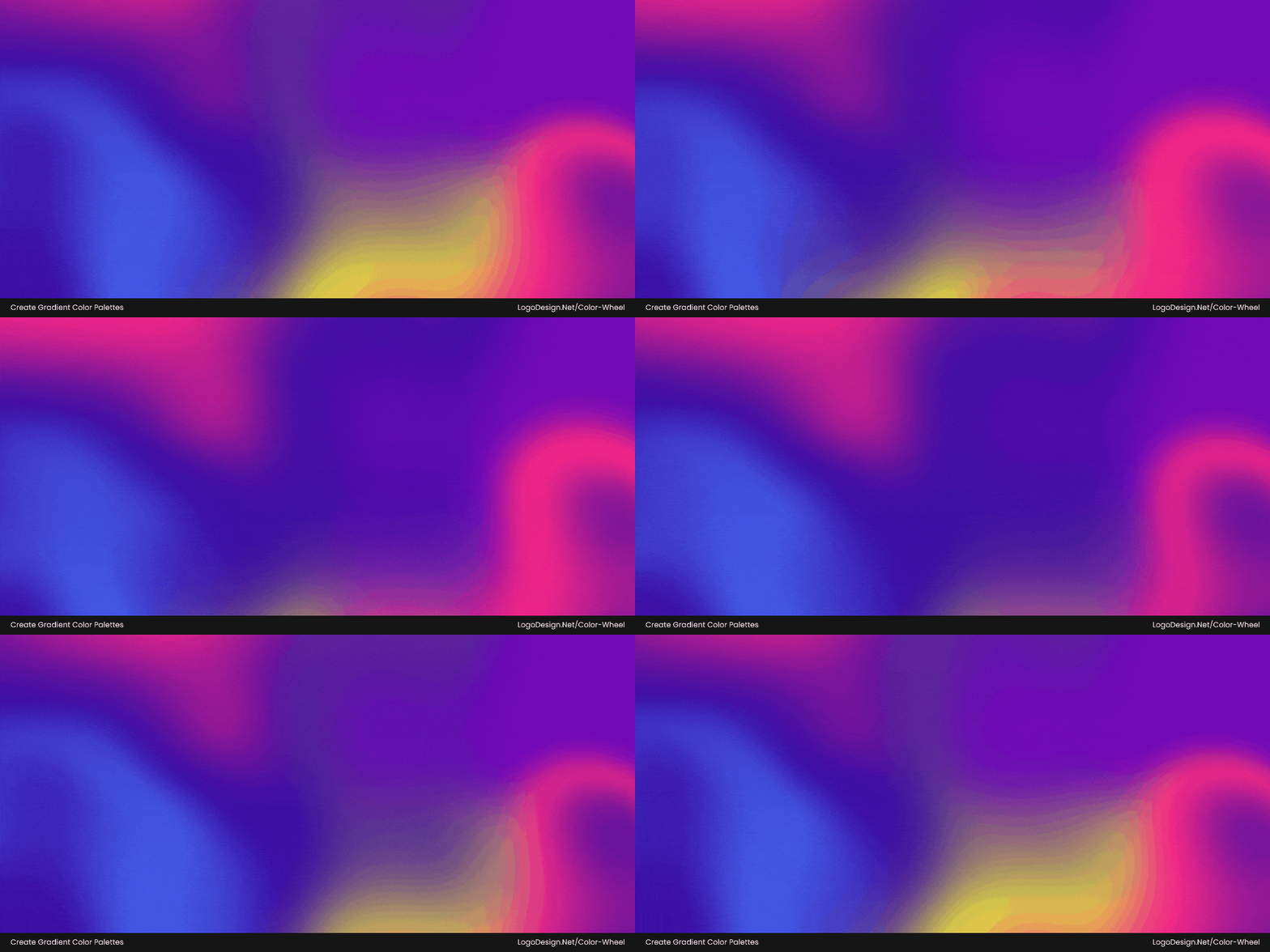
Some examples of trendy hyper-gradients used to design logos.
These are not your typical linear gradients; instead, they blend multiple hues across the color wheel in fluid, often animated transitions. Think rich purples melting into vibrant oranges, electric blues bleeding into neon greens.
Hyper-gradients are less subtle and more about showcasing energy, innovation, and digital sophistication. However, choose gradients over flat colors only if they enhance clarity, scalability, and align with your brand’s personality.
Common in Creative, IT, and AI Tool Branding
AI platforms utilize them to highlight dynamism, complexity, and cutting-edge capabilities. Creative brands, for instance, are also moving towards these palettes from traditional blues and greys, as seen in communication and media logos.
Information technology companies and cloud platforms often use hyper‑gradient colors in their logos and branding, leveraging vibrant transitions to evoke innovation, energy, and forward‑thinking in their brand color psychology.
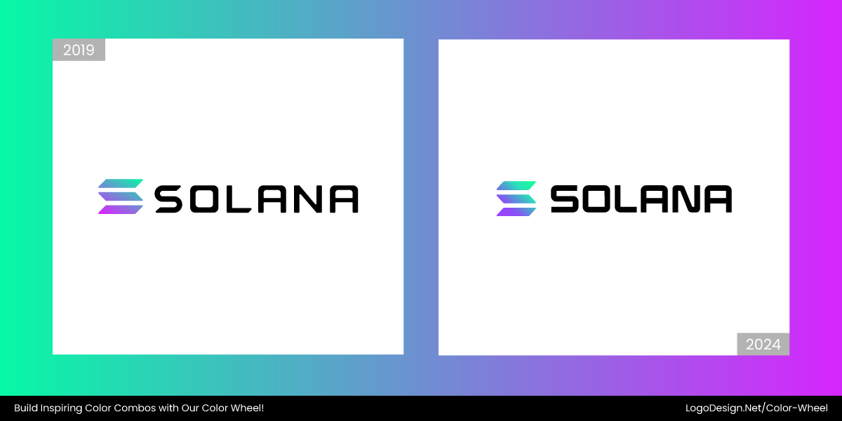
In 2024, the Solana logo replaced the bold neon palette with electric green and soft pastels like lavender, aqua, and misty blue. The signature three-bar icon was also refined with a gradient to show innovation.
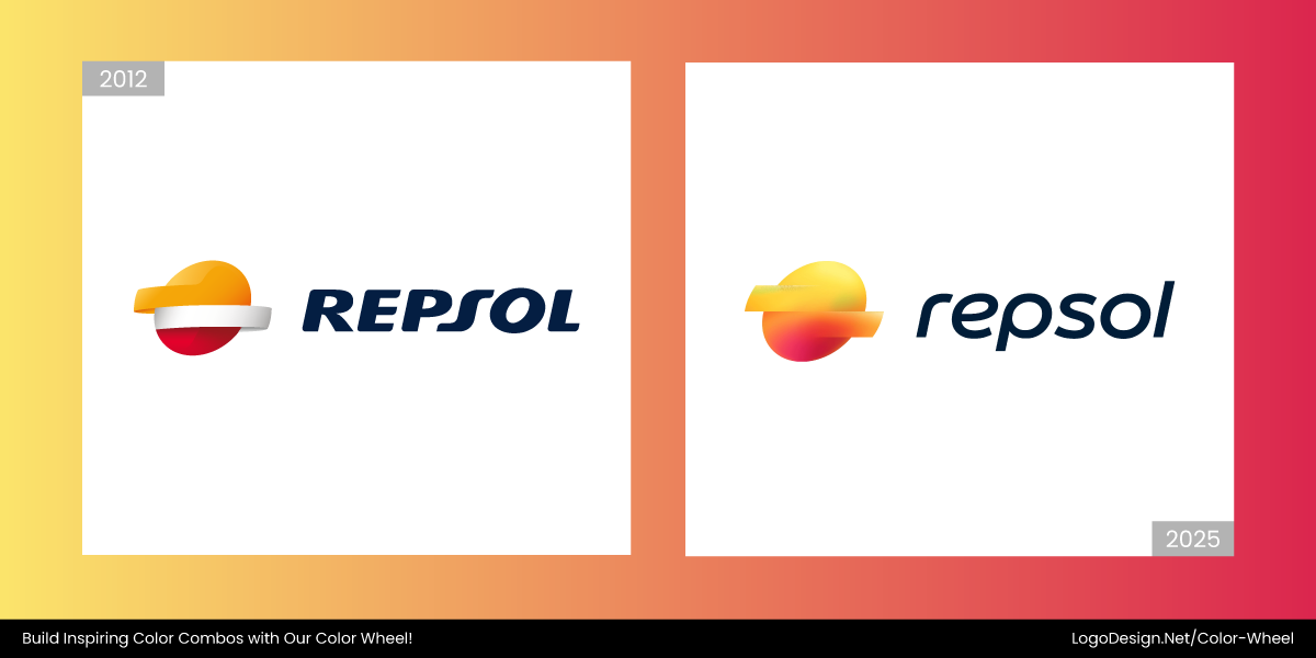
In mid-2025, Repsol, after becoming a multi-energy provider, changed its logo to a primary gradient that transitions from orange to magenta. The new logo complemented its brand values, with the colors representing fossil fuels and technology.
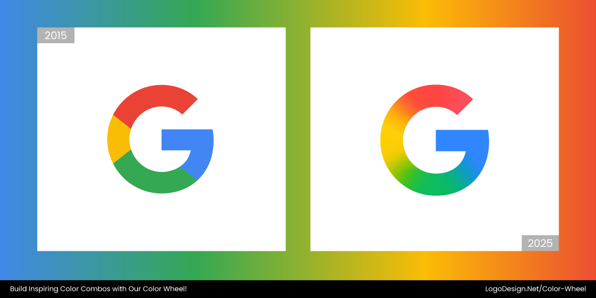
From a flat-colored G logo, Google transitioned to a hyper-gradient spectrum, retaining the same (red, yellow, green, and blue) colors. This shows Google is adopting digital technology and trends.
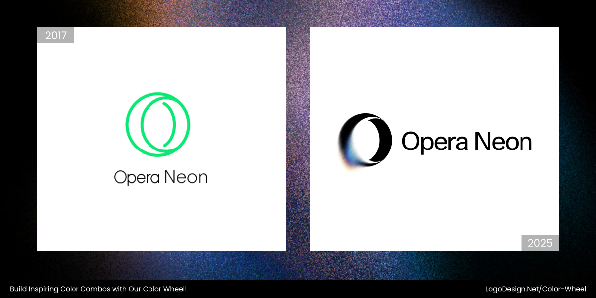
The new Opera Neon logo illustrates vibrance, intelligence, and creativity using vibrant purple and pink gradients for its main logo. The stylized “O” appears neon-like, showcasing the brand’s tech-forward personality.
The Deepnote logo brought a futuristic feel, featuring a hyper-gradient spectrum of deep blue, teal, purple, and magenta. It also uses layered depth to show a collaborative and human-friendly identity.
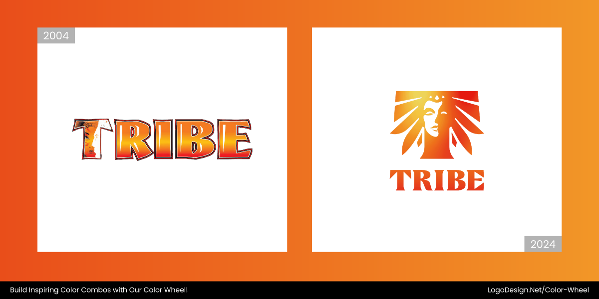
The Tribe Carnival’s rebranded logo features a stylized human (both male and female) face shaped like a “T.” The color palette now utilizes a gradient of warm yellows and oranges that conveys the energy, vibrancy, and spirit of the carnival.
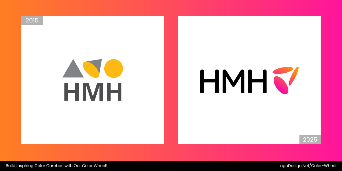
In 2024, the new HMH logo showed a bold hyper-gradient spectrum of hot pink to fiery orange to show continuous growth, energy, and connection. This transformation displayed HMH as an ed-tech leader.
4. Desaturated Metallics
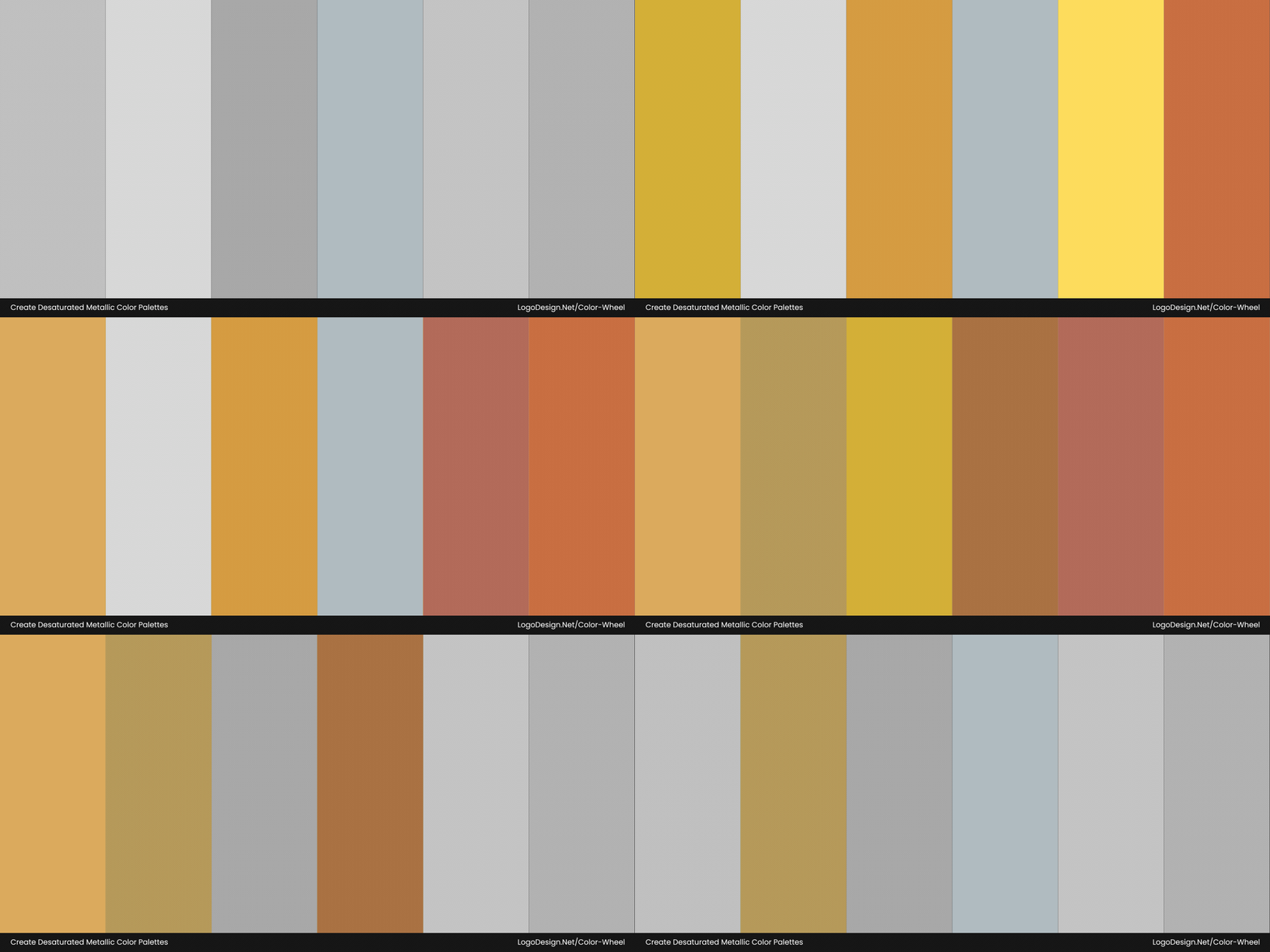
In 2025, say goodbye to the overly polished, mirror-finish silvers and chromes in logo design. The new wave is all about desaturated metallics like matte gold, champagne silver, and rusted bronze. These tones are understated, elegant, and deliberately subdued, offering a modern take on luxury that feels grounded and approachable.
Desaturated metallics convey heritage, craftsmanship, and quiet luxury for brands. These traits align with the values and patterns that influence a wide demographic of consumers, particularly Gen Z.
Common in Luxury, Automobile, and Retail Branding
Muted golds and bronzes can show premium quality without overwhelming the product. Similarly, the colors also work for modern boutiques, automobile branding, and jewelry logos. The use of matte metallics draws attention to innovation and elegance.
In late 2024, Lindt‘s logo changed to a muted brushed golden tone with refined presentation that shows a minimalistic approach, luxury appeal, and respect for heritage, without overwhelming the viewer.
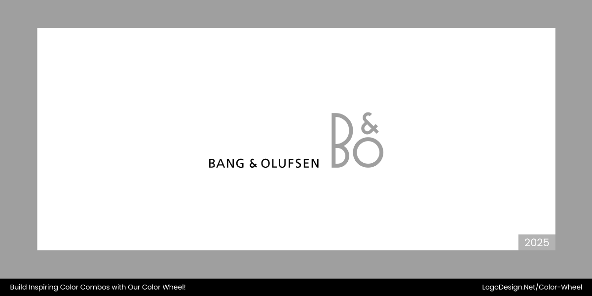
Bang & Olufsen’s timeless logo defined sophistication and luxury through desaturated metallics like brushed aluminum and matte platinum, while its minimalist monogram conveys timeless modernity.
The Cartier logo illustrated luxury and understated refinement using desaturated metallics like brushed platinum, antique silver, and soft rose gold. It also shows a legacy of elegance and discreet opulence.
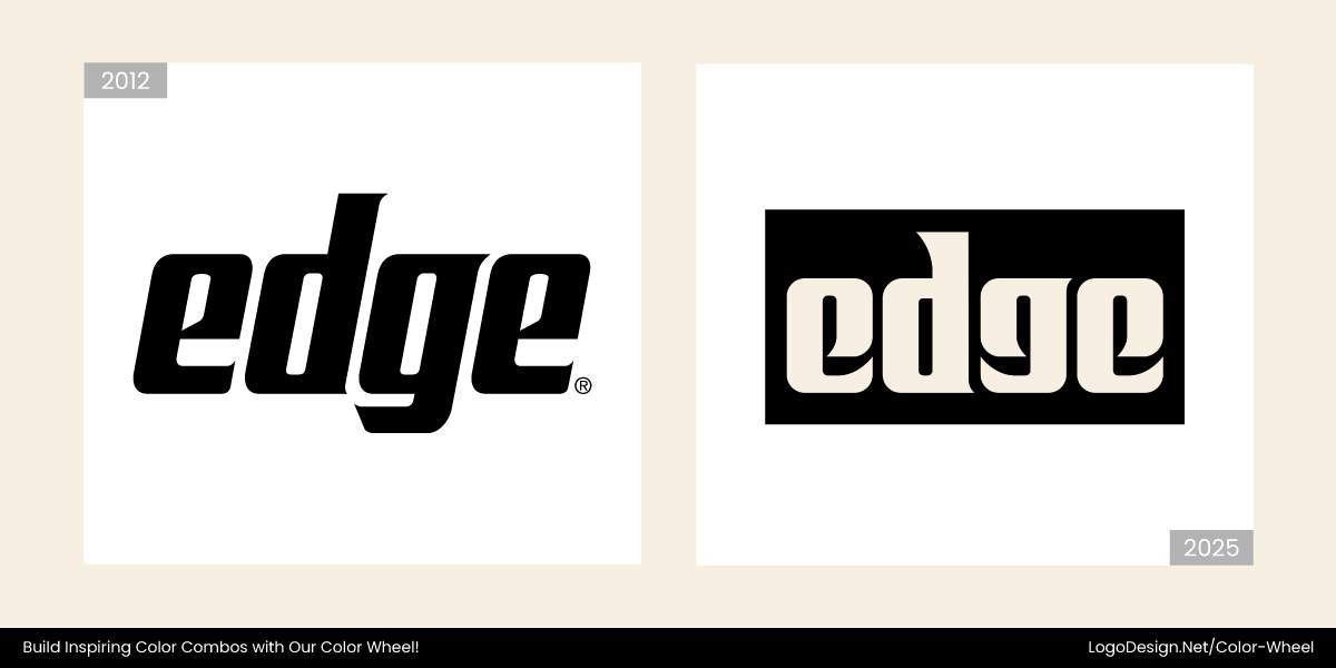
With a sleek desaturated metallic palette featuring tones of brushed steel, matte silver, and graphite, the new Edge logo, designed in 2025, evokes precision with a refined, technical, and confident feel.
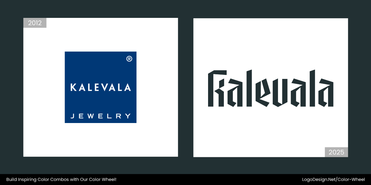
The Kalevala logo’s timeless appeal is achieved by using desaturated metallics like brushed silver, antique bronze, and oxidized iron, while the engraved, rune-inspired form reflects a handcrafted identity.
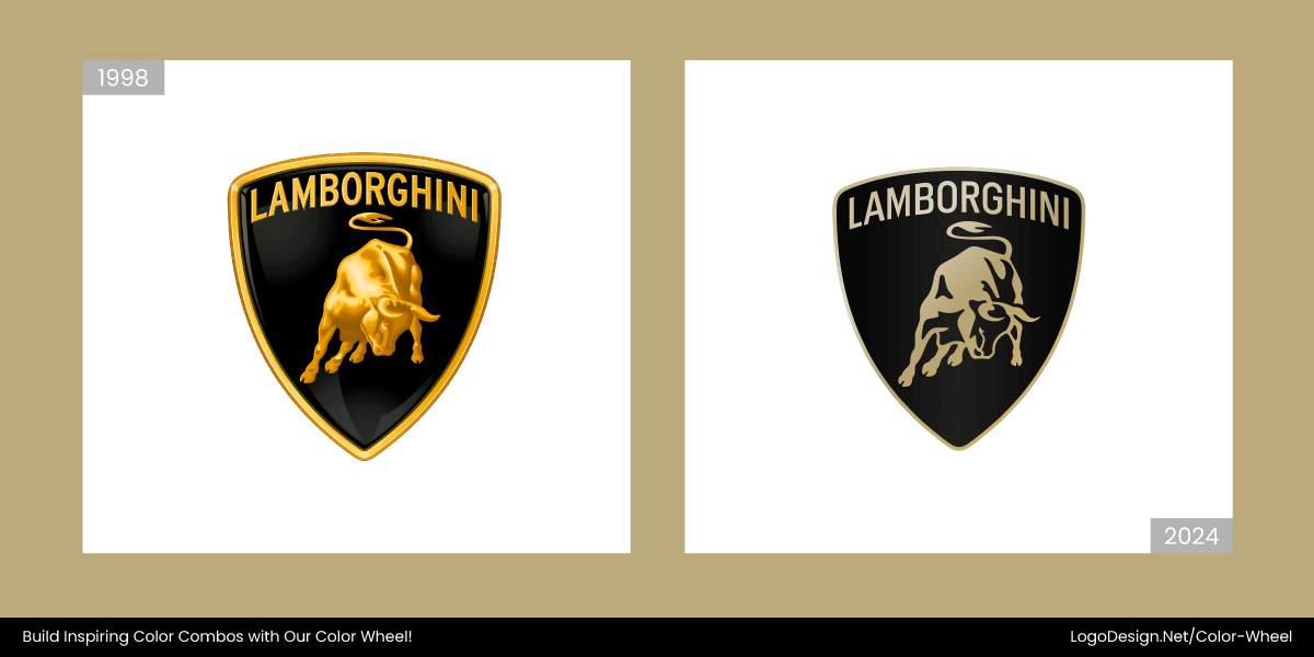
The Lamborghini logo combined precision and prestige. Its desaturated metallics include brushed platinum, dark steel, and anodized aluminum gray, along with the shield highlighting power and performance.
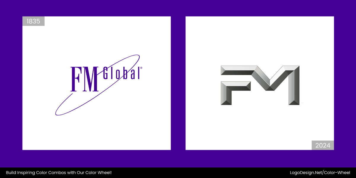
In 2024, FM Global changed its logo by introducing a desaturated metallic scheme of steel gray, titanium, and stone tones to show industrial precision and engineering authenticity that signals strength.
5. Punchy Monochromes
Some of the most striking logos won’t use complex gradients or multiple colors. They’ll go all-in on one bold color. The punchy monochrome trend is about owning a single, standout hue like electric teal, clay orange, mustard yellow, acid green, or neon lilac.
One color, used boldly, is not only memorable, it also plays well with minimalist designs in graphics, allowing people to focus on the product or message right away. When you have to think between monochrome or multi-color logos, do keep relevancy in mind as well.
Common in Skincare and Lifestyle Branding
Commonly, skincare logos use one bold or subtle color for a minimalist, clean look. You’ll also find quite a few lifestyle companies choosing vibrant hues like hyper blue or coral red to stand out in app stores and browser tabs.
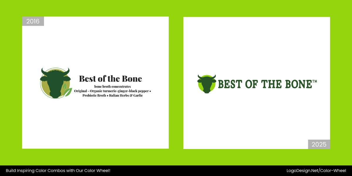
In the new logo designed in 2025, the Best of the Bone changed to a custom typography inspired by bone shapes and a minimal design, while the earthy colors reflect a natural, ingredient-focused identity.
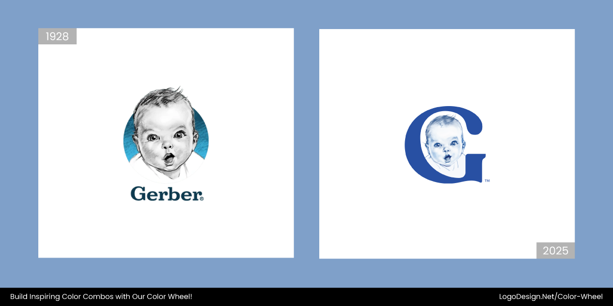
Changed in 2025, the new Gerber logo preserved the iconic black-and-white sketch of the Gerber Baby within a bold blue circle, while showing a simplified design for a parent-friendly identity.
In March 2025, the new EcoRodovias logo launched a modern identity with a leaf-shaped symbol representing environmental balance. The refreshed monochrome color palette reflected clarity and digital versatility.
Recently, in June 2025, AEMET decided to change its logo to show a scientific identity by using a minimalist blue-and-white palette, while the stylized map of Spain reflects its nationalistic approach.
The new ComPsych logo, changed in 2025, conveys a sense of expanding support through a radiant sphere with ripples, while the color palette reflects a forward-looking identity.
King’s Hawaiian’s logo also revamped this year and adopted a richer palette of vibrant orange and soft cream tones. The brand’s fresh-baked warmth appeals to the appetite and shows cultural authenticity.
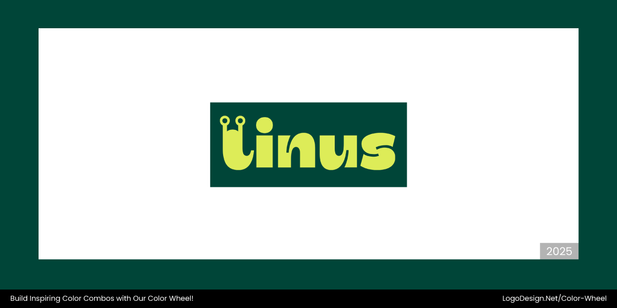
The Linus Prep logo shows a green slug mascot integrated into a clean, lowercase logotype. This nature-inspired palette reflects a playful and friendly brand identity for student learning.
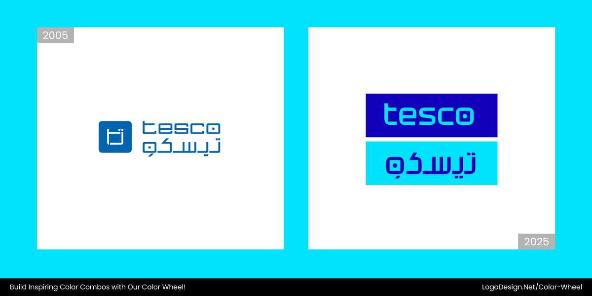
Tesco Jordan’s new logo adopted a stylized “Tesco” text that appears in a modern font in a blue color scheme. The tech brand’s monochrome logo also incorporates a small, distinct dot.
6. Dark Backgrounds
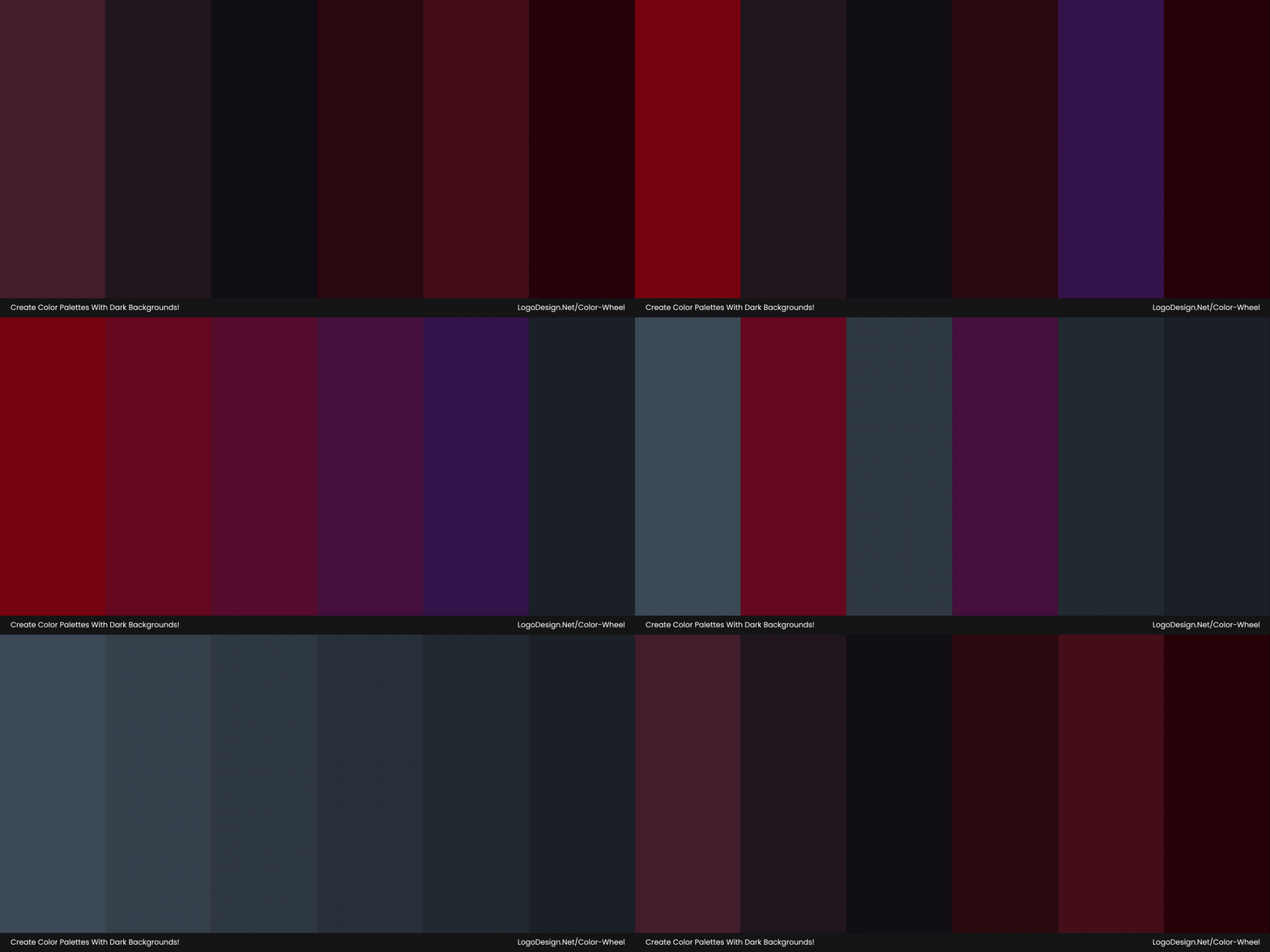
Rich navies, deep charcoals, and black-on-white aesthetics are setting the stage for vibrant accents and metallic finishes to pop with confidence and clarity. This trend reflects a shift toward sleek style and digital-first design.
Common in Fintech and Creative Branding
Brands in finance, travel, and creative industries are switching or adapting logo colors that feature a contrast with a dark background. The deep contrast gives brand identities a bold, luminous edge that feels fresh and memorable.
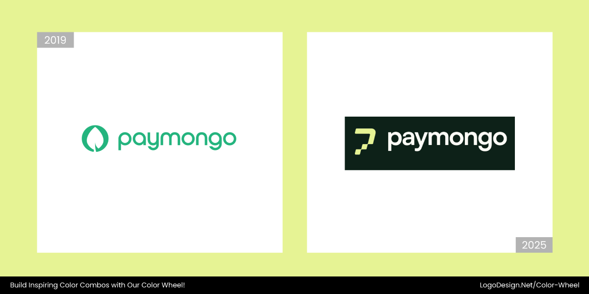
In early 2025, the new PayMongo logo replaced the old one with a solid white design and a flat black version. Combined with the leaf and the wordmark, the logo shows minimalism and a mature brand identity.
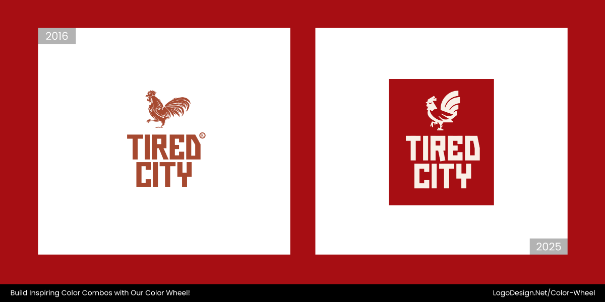
Coming out with a refreshed visual identity in 2025, the Tired City logo has a minimalist appeal. It used whites and light neutral colors on dark backgrounds, and the geometric lettering makes a clean design.
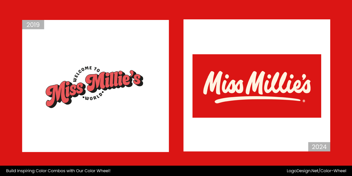
The Miss Millies’ logo was changed in late 2024 to bring a bold modern appeal by using a richer red backdrop and a handwritten-style wordmark, while the mascot-free design reflects a fresh identity.
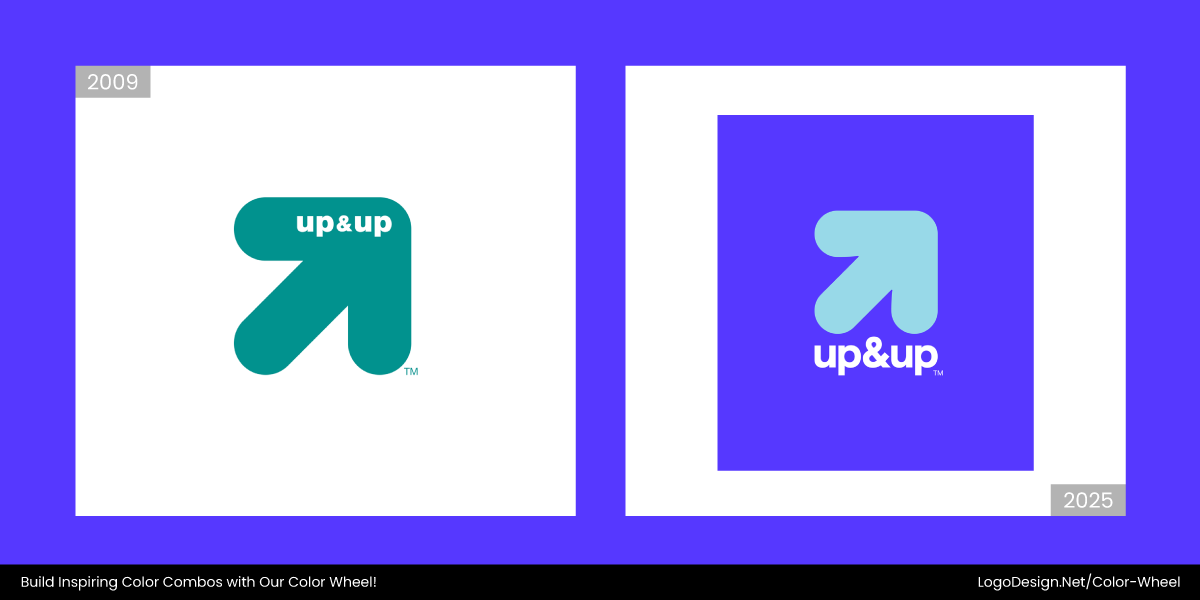
Between 2023 and 2024, up&up (Target brand) shifted to brighter light blues set against deep violet-toned backgrounds. Structured color-blocking conveys clarity, and the handwritten-style wordmark also shows simplicity.
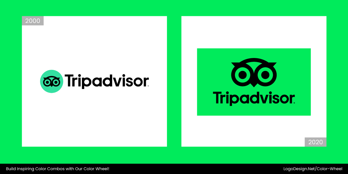
The new TripAdvisor logo has a modern appeal, with elements like black circular eyes and a beak. The stylized owl face on a dark green background reflects clarity and digital adaptability.
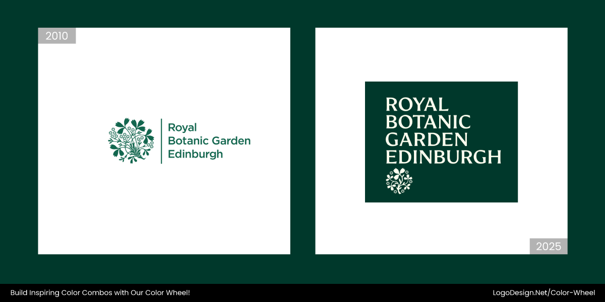
Having recently changed its logo in mid-2025, Royal Botanic Garden Edinburgh conveys heritage through a stylized thistle. It uses white, silver, or light gray on dark backgrounds to give a scholarly identity.
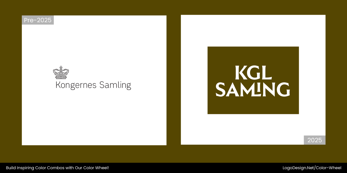
The Kongernes Samling logo, using flat white or light tones on dark backgrounds, evokes timeless dignity. The elegant serif typeface shows a modern yet historically rooted royal identity.
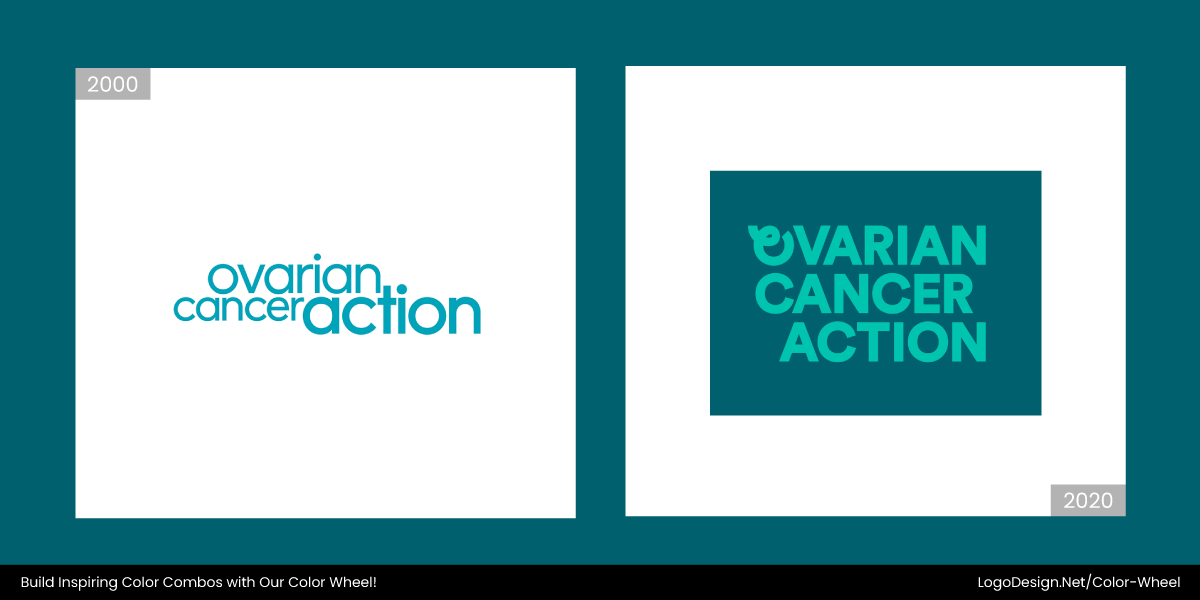
In August 2024, the Ovarian Cancer Action logo changed to show a more modern identity. It now pairs light-toned sans-serif text with a high-contrast palette to ensure clarity across dark backgrounds.
7. Solid Black Wordmarks
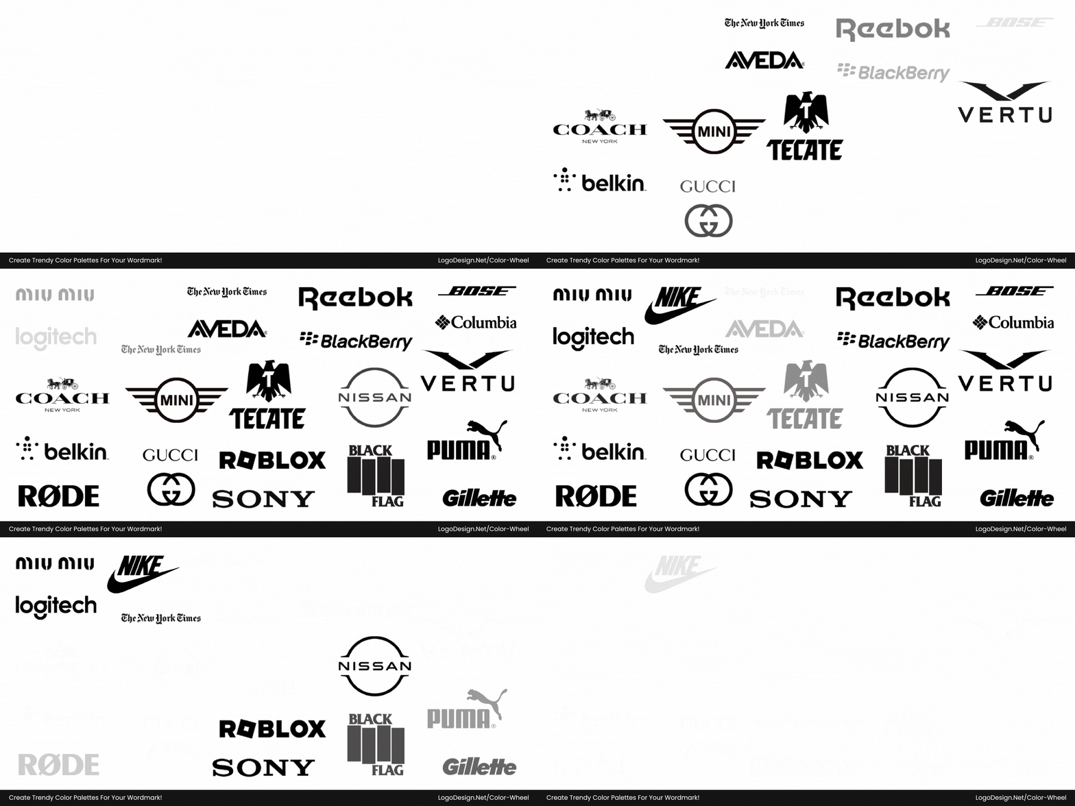
The minimalist design creates and brings out a sense of professionalism, elegance, and timelessness in logos. A flat black wordmark stands out by doing less, without additional effects. These wordmarks are simple and draw focus to clear typography.
Common in Streaming and Media Branding
Black communicates authority and power, and that makes it perfect for media brands that want to be trusted sources or cultural icons. With digital and mobile-first design taking over industries such as media and streaming, the solid black wordmark provides versatility across screens.
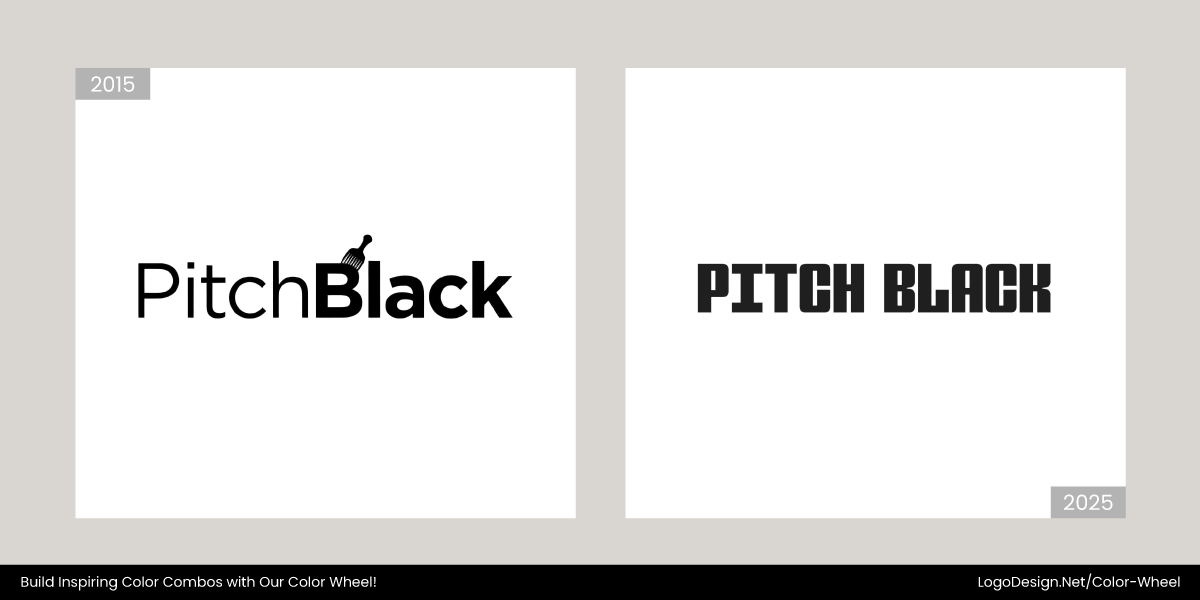
While Pitch Black’s logo is a black wordmark, they have recently made slight changes to the typography to make it bolder and thicker.
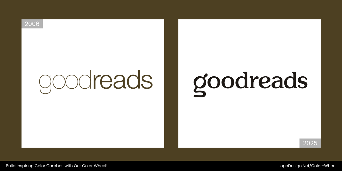
Having recently updated its logo for the second time, Goodreads‘ logo shows a solid black serif wordmark in all lowercase for a modern look, while its minimalist design suggests a reader-focused identity.
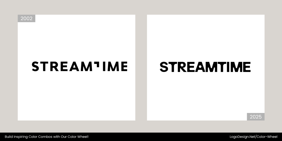
Recently updated in early July of 2025, the new Streamtime logo conveyed simplicity through a bold, sans-serif wordmark in solid black. The logo design also communicates efficiency.
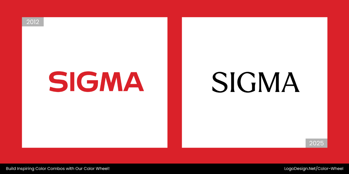
In 2025, the new Sigma Computing logo displayed simplicity through a solid black, uppercase wordmark and rounded geometric design to reflect accessibility and the company’s mission.
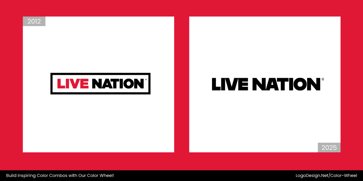
The new Live Nation logo, updated in 2025, uses bold, solid black sans-serif lettering in a compact, all-caps layout and a white background to convey a modern yet simple appeal.
The Basker Brewing Co. logo shows a confident simplicity by using solid black geometric sans-serif typography, while the clean, uncluttered form reflects a precision-driven identity.
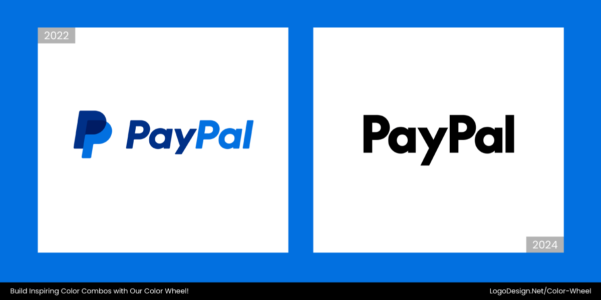
The PayPal logo, changed in 2024, has replaced the dual blue and yellow palette with a simplified black-and-white palette and a shade of blue. The updated logo works well for a consistent mobile-friendly identity.
8. Dark Mode Optimization
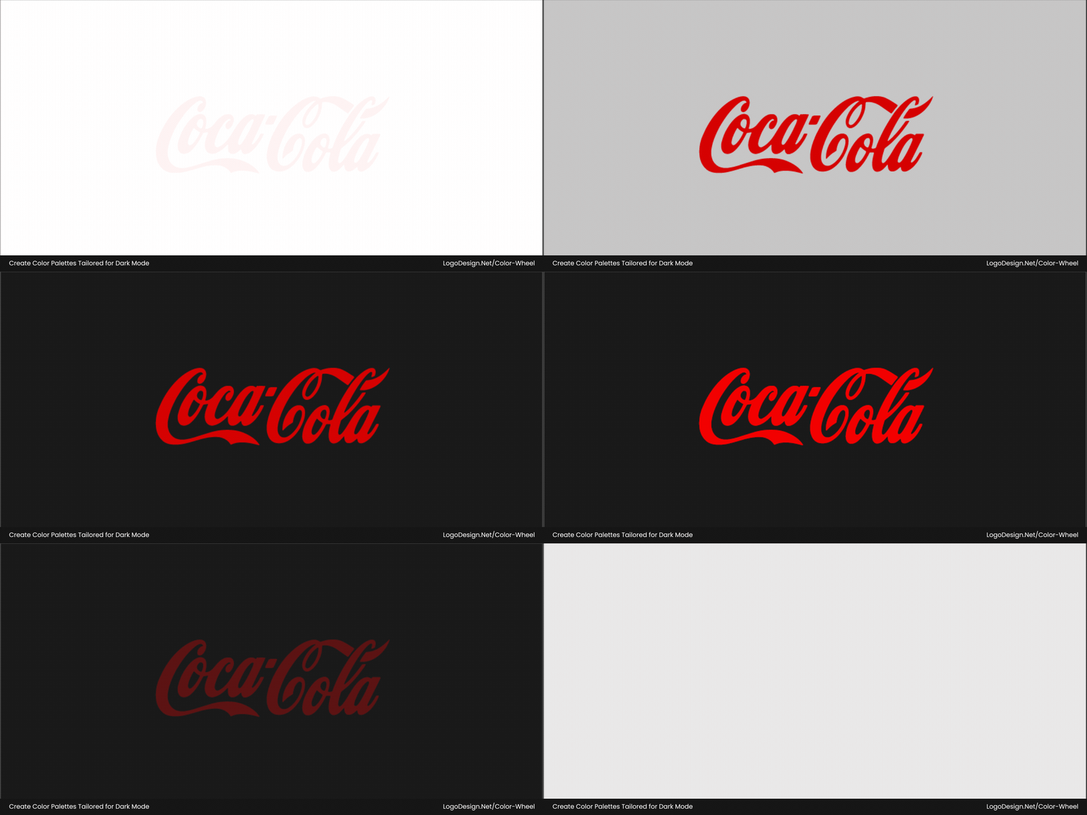
Companies are moving towards alternate logo versions that are designed for dark mode. Simplified color schemes, subtle glow effects and versatile typography are some of the elements being added by brands.
Common in Software and Retail Branding
To stay visually effective, dark mode logos are especially adopted by logos in the tech, e-commerce, streaming, and finance space. That’s because as more devices and apps adopt dark mode by default, logos that clash with darker interfaces feel outdated. A logo that looks sharp in dark mode is quickly becoming a must.
Coca-Cola updated its iconic logo by adding red outlines around the white script to improve visibility. This subtle change ensures clarity in dark mode while preserving a consistent brand identity.
Spotify optimized its green logo with high contrast to ensure visibility on both light and dark modes, using black, white, or green variants. These versions follow brand guidelines for visual clarity across platforms.
The new Slack logo provides a white one-color version, featuring a white background to ensure visibility on dark or colored backgrounds. This variant was introduced because the previous version lacked adaptability.
In early 2025, Walmart debuted a new logo with a True Blue font color to be more visible on dark-themed digital platforms. It also shows bolder yellow spark to enhance clarity and maintain its brand recognition.
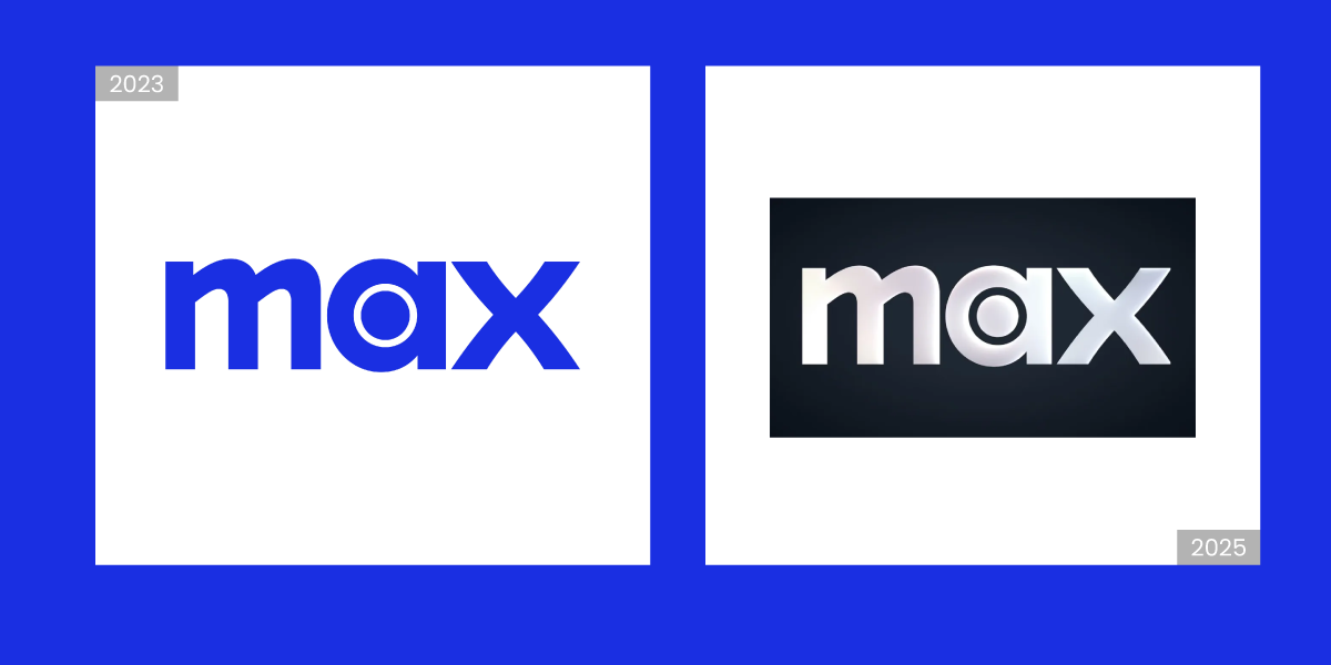
In May 2023, HBO Max shifted from a bright blue logo to a stark black-and-white palette. With this change, the minimalism in design showed HBO’s legacy, along with making it more clear in darker backgrounds.
What’s Out: Fading Color Trends in Logo Design
Overused bright hues, overly corporate blue palettes, and excessive minimalism are being replaced by color-forward and more thoughtful color choices. Brands also have to pick logo colors that integrate with various cultures, so a lot of brands are shifting towards different combinations.
Let’s take a look at some of the trends that are fading in 2025 and may not return for a while in the future.
1. Muted Colors
Dusty mauves, soft browns, and pale blues were popularly used in logos for their soothing appearance. Wellness brands or startups promoting sustainable practices went with such colors to convey their brand message.
But in 2025, these tones often lack the visual punch needed to stand out in vibrant, content-heavy digital spaces, making them less effective for modern branding.
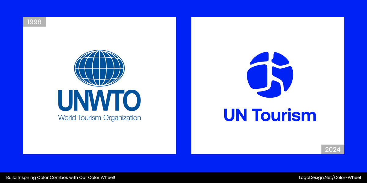
The UN Tourism logo, originally designed with muted tones to convey stability, transformed into a vibrant symbol of global connectivity with bold azure blues, emerald greens, and energetic indigos.
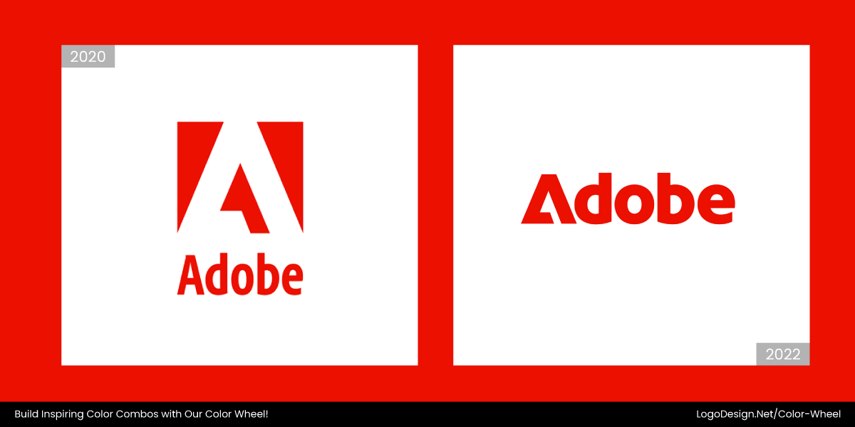
In 2025, Adobe logo shifted from a muted tone to a vibrant one, highlighting its evolution from a quiet creative enabler to a front-facing innovator. With brighter red and a new Adobe lens frame, it gives a more appealing look.
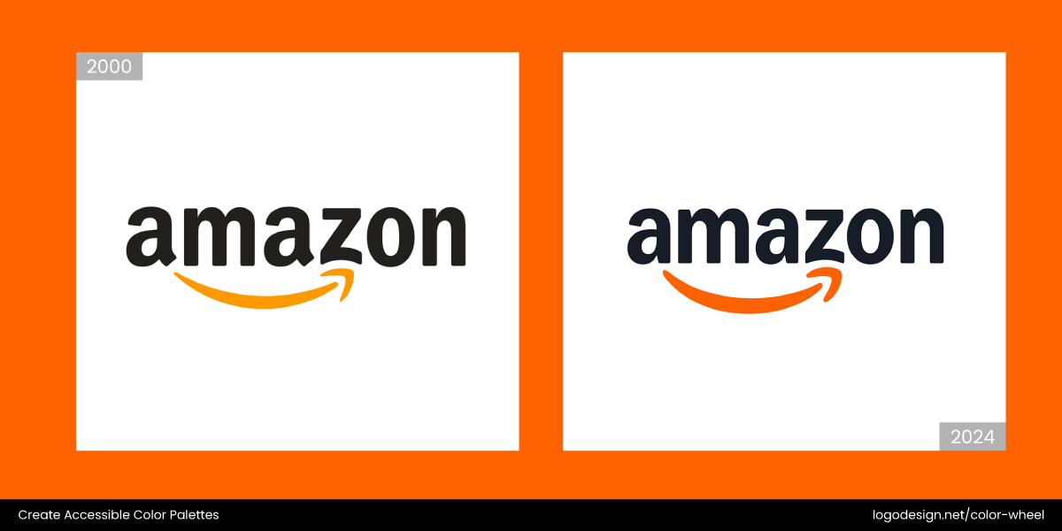
Amazon evolved its visual identity from muted tones, like flat black text and subdued orange, into a more vibrant palette featuring saturated golden-orange, bold blues, and dynamic gradients across its platforms.
In May 2025, Eggo logo transitioned from flat, muted packaging with dull yellow tones to a vibrant design featuring rich colors. This unified the brand’s warm, family-friendly identity for an emotional connection.
Brot für die Welt recently transitioned from a muted black-and-orange logo to a more vibrant, energetic design while retaining the iconic “o.” This aims to modernize the brand’s voice to engage a younger audience.
Grubhub’s logo 2025 redesign brings a bold, vibrant orange-centered identity with custom typeface, and a playful visual for a stronger emotional connection. The thick brush strokes add to the vibrance that can draw attention.
In 2024, Envato rebranded by evolving its iconic leaf logo and shifting from a muted color palette to vibrant, saturated tones, reflecting a more modern and expressive identity for a better connection.
2. Primary Color Combos
Primary colors were once the go-to choice for brands seeking clarity, boldness, and universality. But in 2025, these overused palettes are beginning to feel common and overly corporate. Just look at some of the classic red-blue-yellow schemes used by companies in the banking and finance sectors.
As consumer preferences shift toward brands that feel authentic and emotional, these traditional colors no longer work as they did before. Instead, they can appear dated, overly digital, or disconnected from modern values.
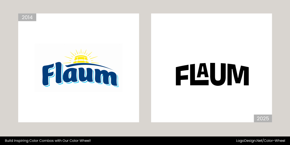
The new Flaum logo replaced its traditional blue and yellow palette with a bold, flat black design. This, combined with clean typography, shows minimalism and a modern aesthetic, signaling confidence and premium quality.
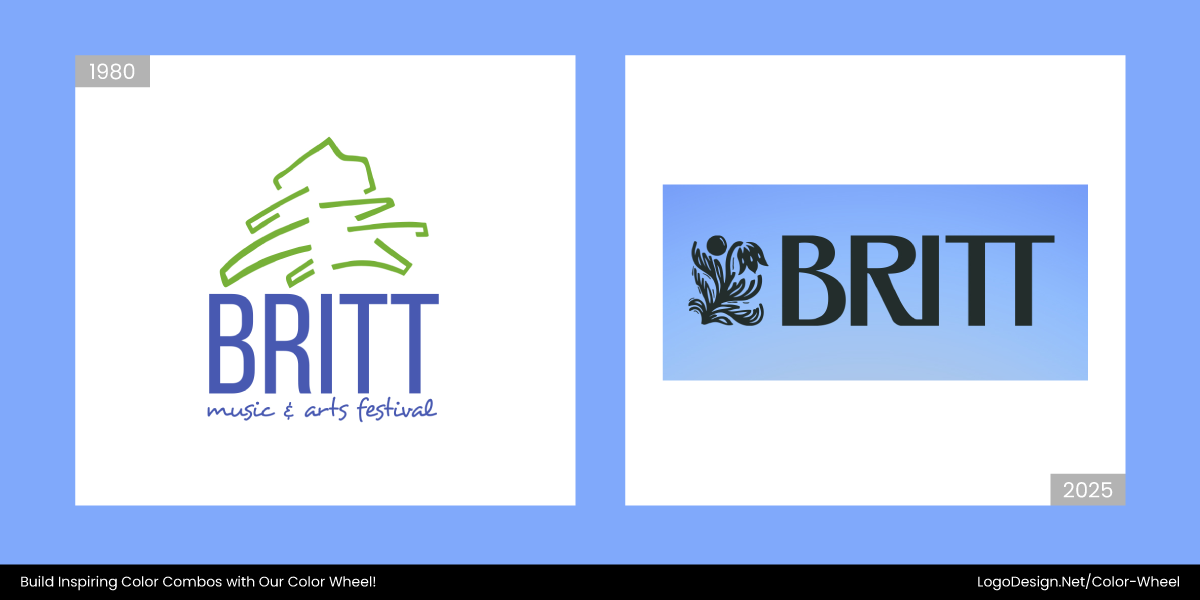
In May 2025, Britt Music & Art festival replaced the signature blue gradient with a deep solid blue color with black and white linework. Additionally, the earthy tone signals a consistent appearance across platforms.
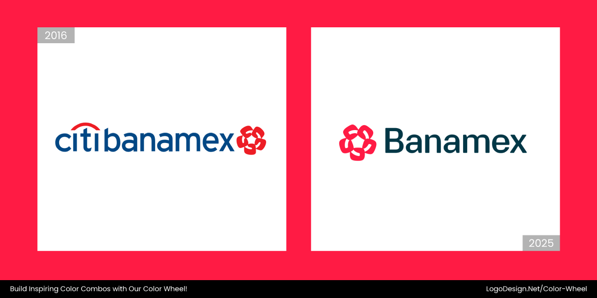
In March 2025, the new Banamex logo replaced the traditional red and royal blue palette with red and dark teal. Adding the color range shows the focus on energy, trust, and national pride.
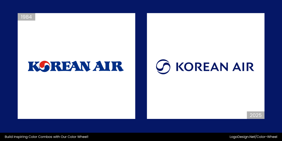
In March 2025, the new Korean Air logo got rid of the red and blue Taegeuk symbol with a monochromatic dark blue design. This, along with a simple wordmark showcases the brand’s global identity.
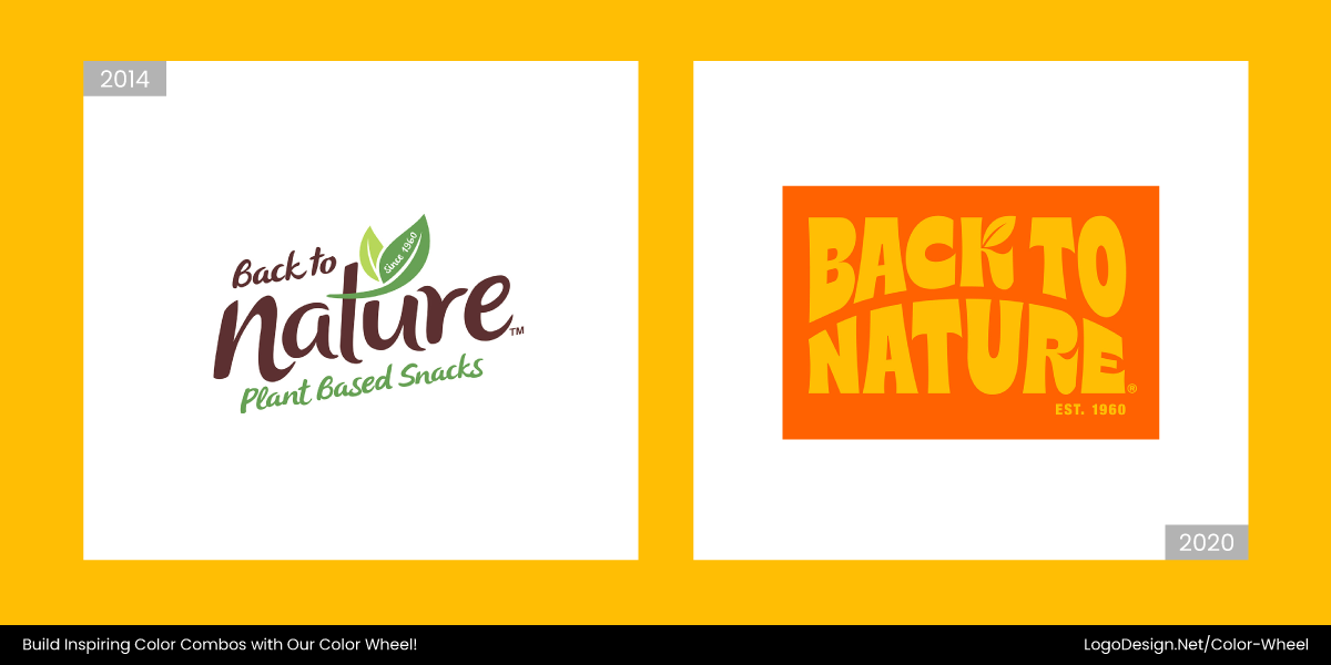
In early 2025, the new Back to Nature logo turned from a traditional brown and green color combination to yellow, orange, and sun-washed hues. The addition of the refreshed leaf icon evokes energy.
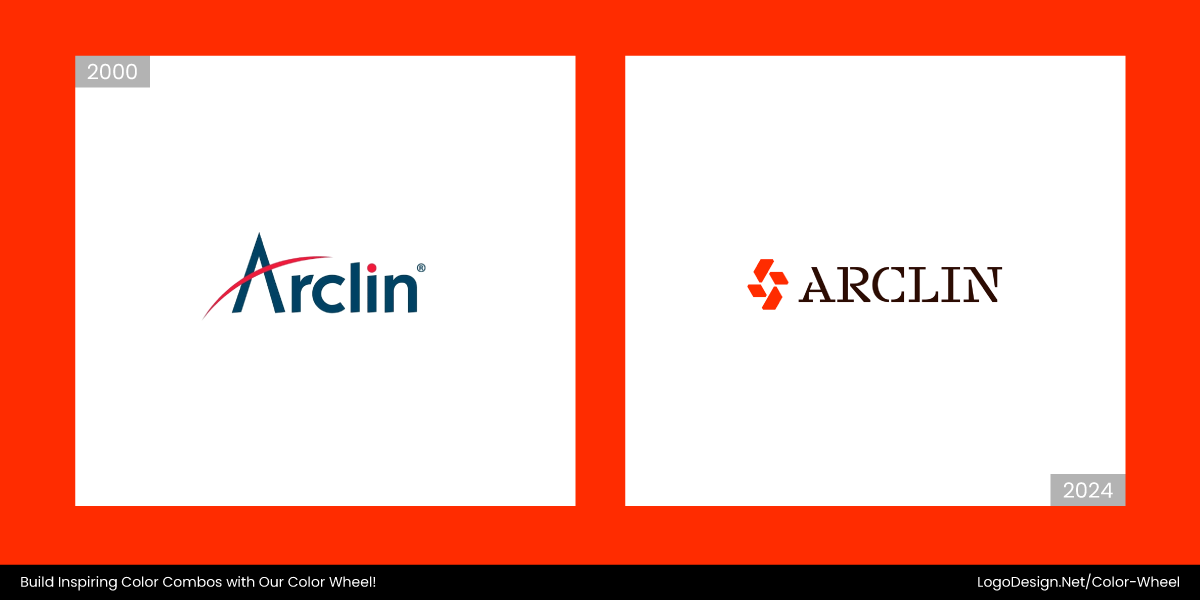
In late 2024, Arclin replaced its red and blue palette with an orange-red combination with deep black. This gave the logo a more scientific look that signals it being a leader in materials science.
3. Glossy Metallics
Bright chrome and fake gold effects are no longer considered premium. In 2025, these overly reflective, artificial finishes have lost their shine. Instead of feeling high-end, they now come off as flashy and overwhelming, especially across digital mediums.
Luxury today is about craft, not gloss. If you’re designing a logo intended to feel high-end, focus on elegant typography, material-inspired palettes, and refined simplicity.
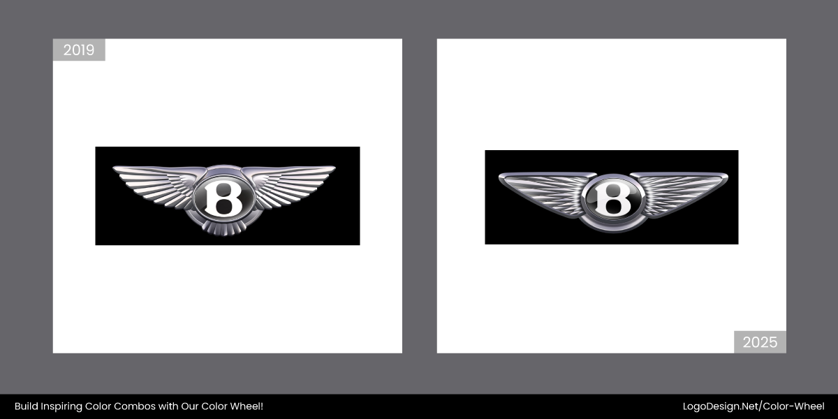
Bentley Motor’s 2025 logo moved away from flat chromes to a deeper, more nuanced metallic finish. The jewel-toned “B” and layered accents elevate the luxury feel without the need for high-shine gimmicks.
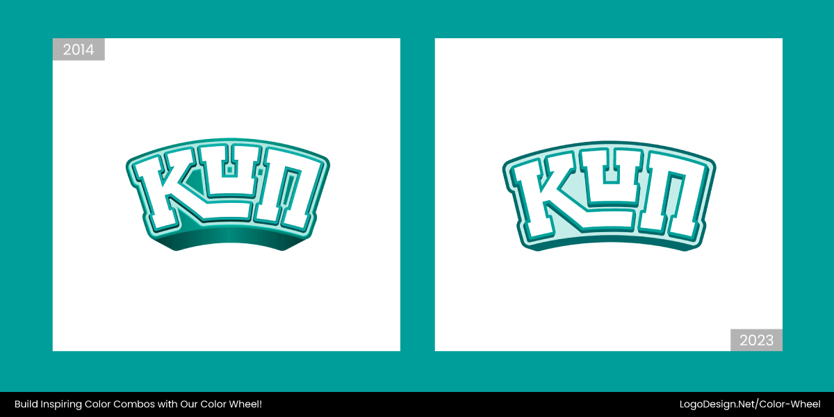
In early 2023, KUN’s logo changed from having a gradient-filled palette to a flat, simplified design. The revamped logo signals modernity that appeals to young and old.
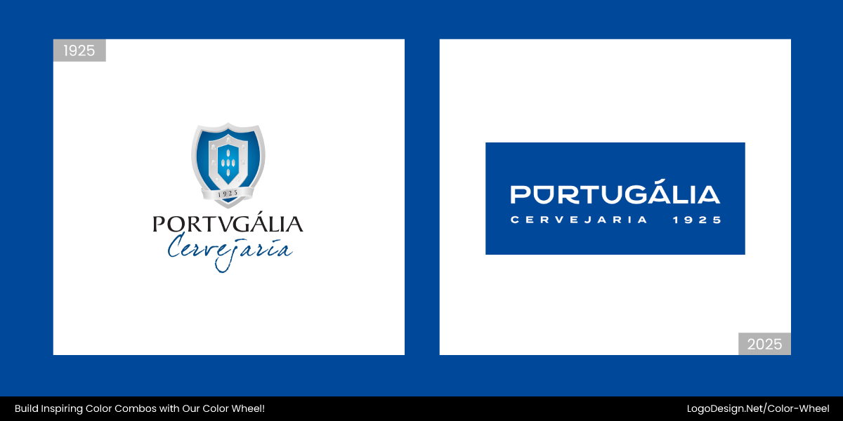
In 2025, the new Portugália’s logo introduced a bold, saturated royal blue for better clarity across platforms. Paired with neutral tones, the new blue supports visual elements and ensures consistent recognition.
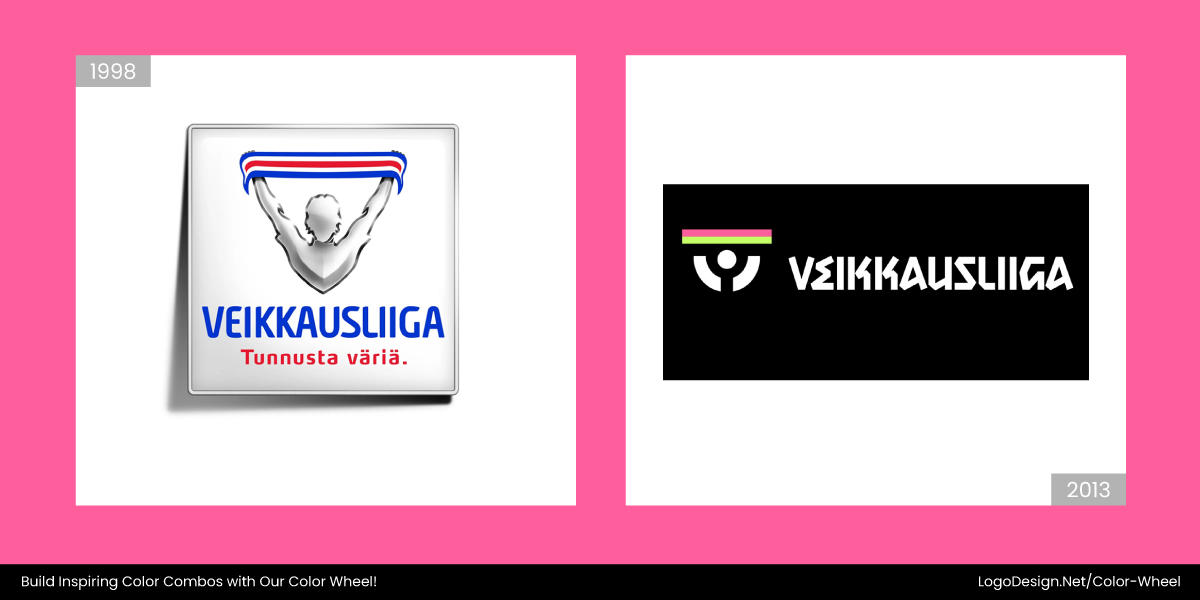
This Finnish football league, Veikkausliiga’s logo ditched metallic shine for electric colors like neon pink and green in 2025. The new look screams energy, youth, and global appeal.
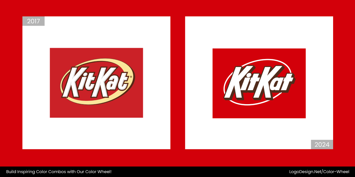
KitKat’s 2024 redesign swapped glossy red gradients for a darker red and crisp white combo. The refined spacing and flat style bring clarity while maintaining its iconic feel.
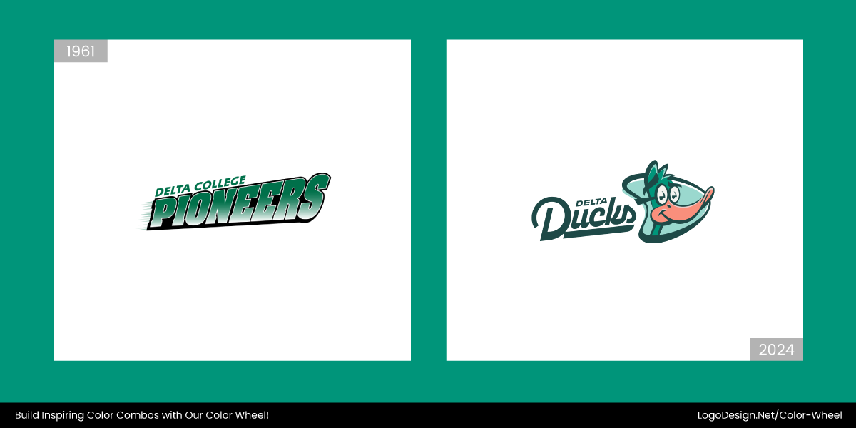
In 2024, the Delta Ducks university team replaced their shiny emblem with a fresh emerald and sky blue palette. A mascot element now brings personality and school pride.
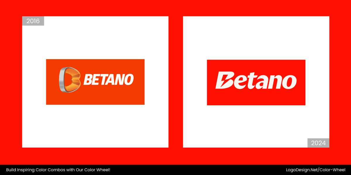
The 2024 Betano logo introduced a punchy red background and a sharp lightning “B.” Clean white text and italic type deliver speed and excitement, without reflective flair.
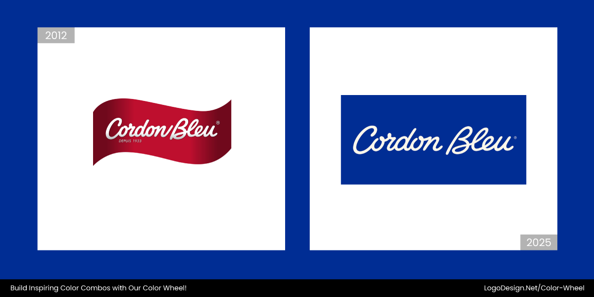
In early 2025, Cordon Bleu went from loud reds to deep blues and a premium script font. The flat design highlights its elevated culinary offering with elegant restraint.
4. Colorless Minimalism/Subtle Greys
Once the hallmark of refined minimalism, subtle greys and near-colorless palettes are beginning to feel uninspired in 2025. While they still hold ground in high-fashion and editorial branding, many logos relying on soft greys now risk looking washed out, especially in digital environments.
For lifestyle, youth-driven, or DTC brands, this quiet aesthetic often lacks the emotional pull and bold visibility today’s audiences expect. As social feeds become more dynamic and visually saturated, grey-toned logos can easily blur into the background, struggling to spark connection or recognition.
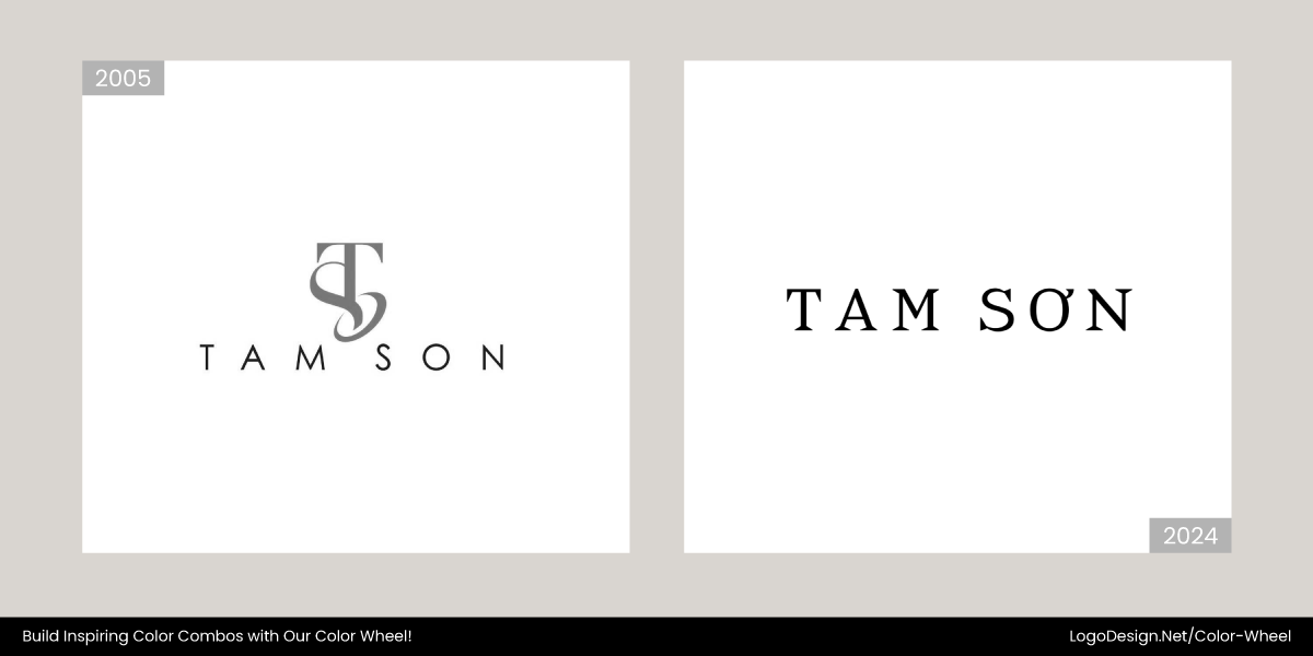
In 2024, the Tam Sơn logo changed from dull grey to a deep blue and teal tone. Combining that with elegant serif typography gave the logo a warmth and cultural depth that made it more sophisticated.
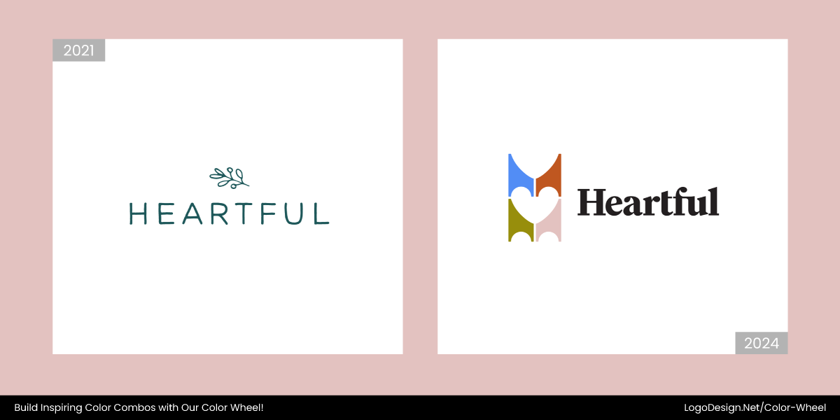
In 2024, the Heartful logo adopted a vibrant palette of deep blue, warm orange, lively green, and bright pink. Additionally, the abstract geometric shapes and central heart conveyed the travel booking platform’s inclusivity and emotions.
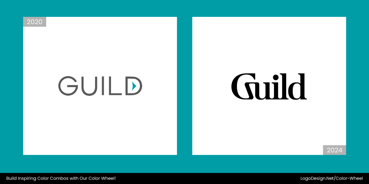
In 2024, the Guild logo was replaced from a subtle grey to a refined mix of black and charcoal accents, along with a custom typography featuring curves and ligatures that gives a human touch and aesthetics. The brand successful jumped on the black wordmark trend!
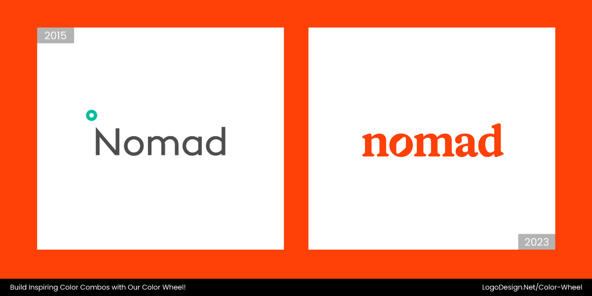
Nomad is another brand that ditched its grey palette and opted for a bold red-orange palette in its new logo in 2023. Combined with rounded typography, it gave an energetic touch and human-like appeal to the brand.
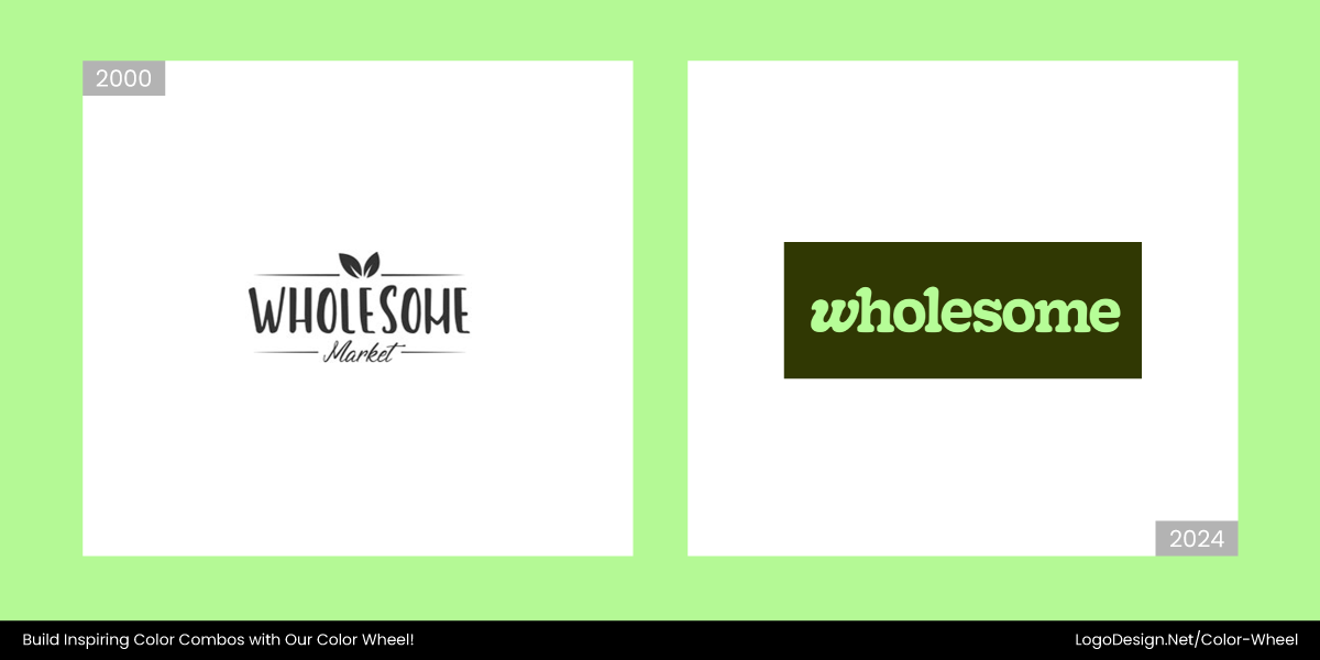
In early 2024, the new Wholesome Market logo transformed to a fresh pastel palette with a signature mint green on a dark background. The new logo emphasizes the brand’s approach to cleanliness and wellness.
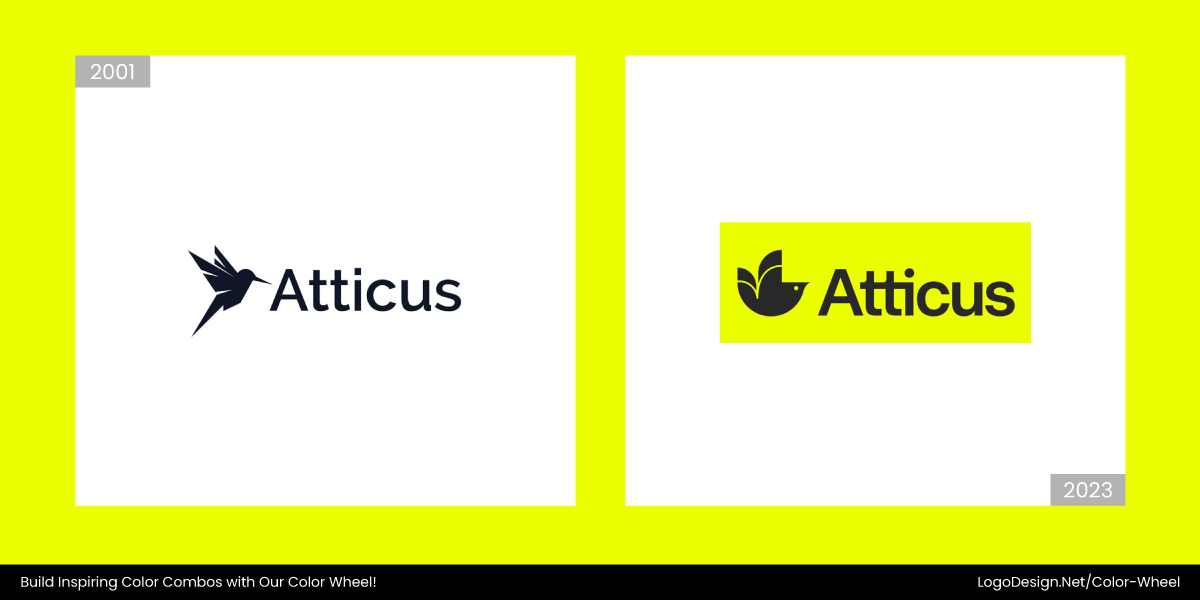
In late 2023, Atticus replaced its logo with a bold, highlighted yellow, a serif typography, and a bird icon that is simple yet memorable. Colorless minimalism is longer trending, and this switch to color reflects that.
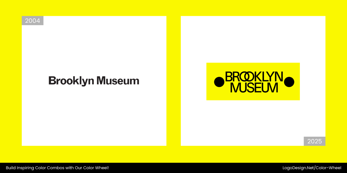
In 2025, the Brooklyn Museum logo changed to a bold system of black typography with a yellow background. This pairing shows creativity and a vibrant brand identity for the viewer.
5. Cool Blues for Trust
Be it banks and healthcare providers or tech firms and SaaS startups, most companies in such industries chose blue for their logos a few years back. It became the safe, default color for showing professionalism and credibility.
Today’s audiences, especially Gen Z prefers colors that have a wider range and a few effects as well. Take the example of TikTok’s logo and its glitch effect. A blue logo can feel generic or predictable when not used thoughtfully.
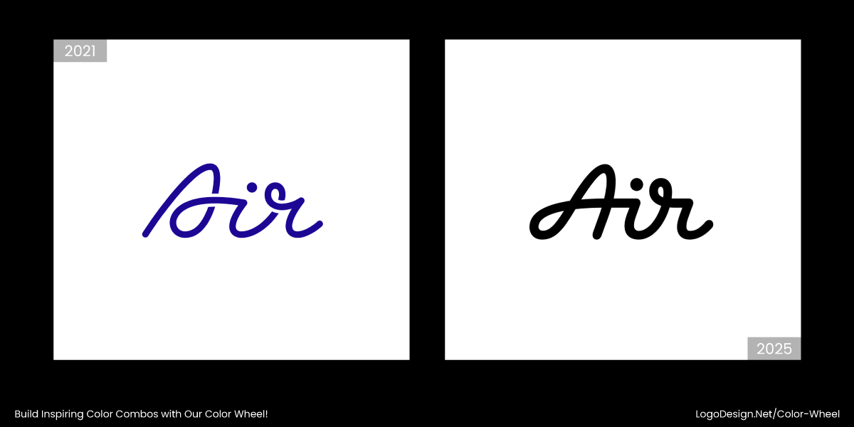
Air’s old logo leaned on a traditional blue palette to signal trust. But as the platform evolved, so did its branding. Now, it showcases a fresher, more dynamic identity that feels agile and less corporate.
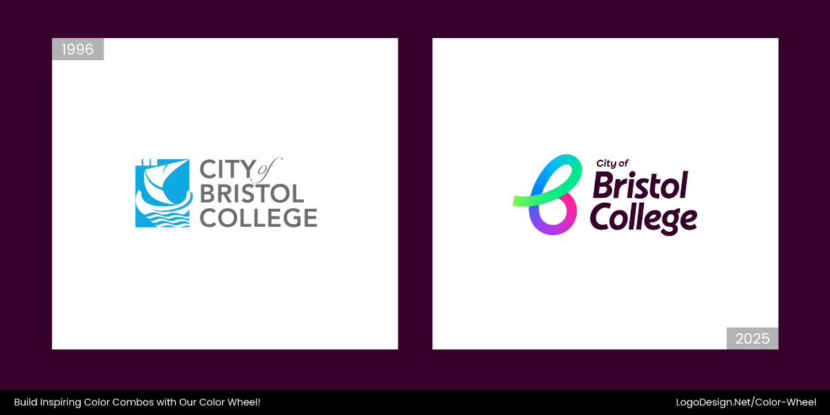
In early 2025, the City of Bristol College replaced its logo with a multi-tonal color scheme, mixed with modern typography. The update brought a youthful, energized feel that better connects with modern students.
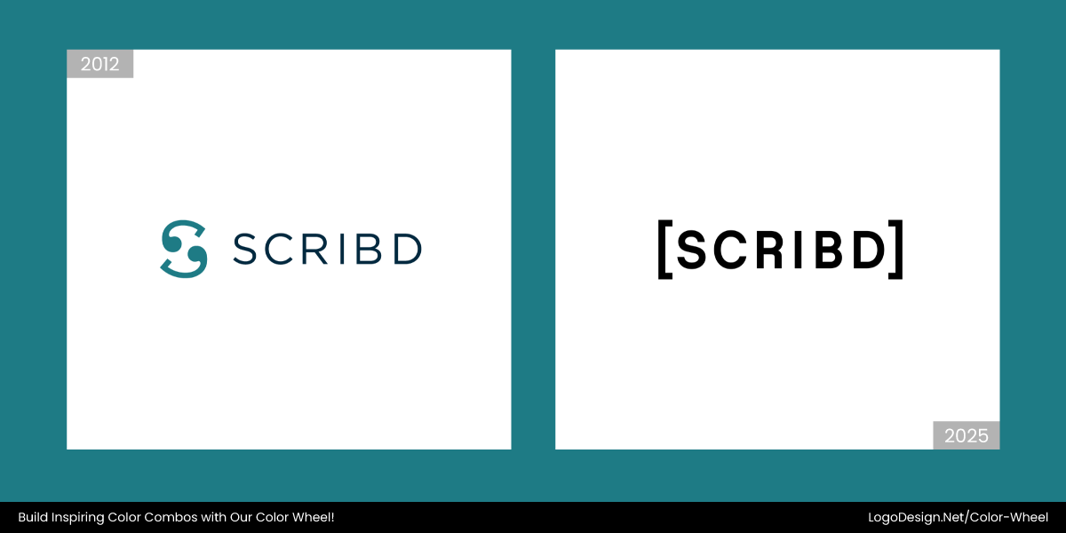
In early 2025, Scribd‘s logo was changed by adding an earthy tone and muted pastel. This, combined with an appealing texture, triggers the feeling of being in a library or surrounded by aged papers.
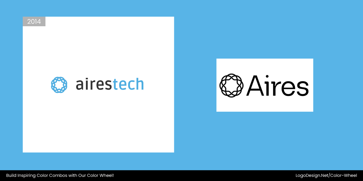
Aires Tech also underwent a logo revamp recently. The brand ditched the classic blue tones for a deeper, tech-forward aesthetic. The updated look feels more aligned with innovation than tradition, exactly what their audience now expects.
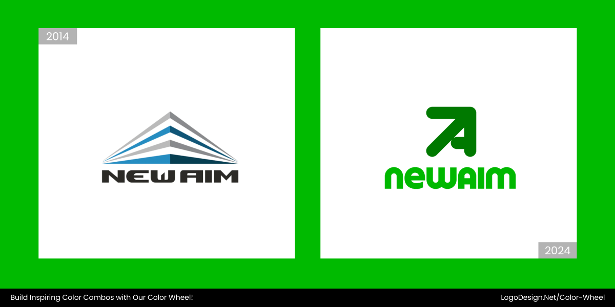
Blue is reliable but at times also bland. In its new logo, New Aim ditches the blue with a fresh green palette. This recent rebrand introduces bolder hues that signal creativity and next-gen commerce agility.
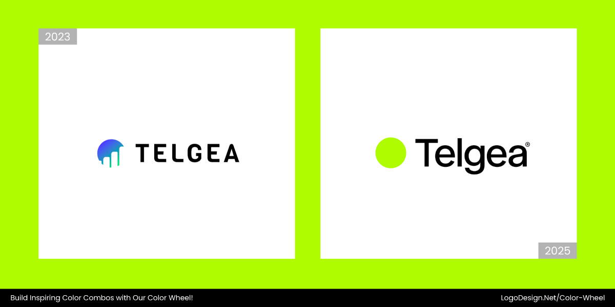
Previously nestled in soft blue shades, Telgea refreshed its logo with gradient accents and expressive color in 2025. The shift reflects their growth beyond just another SaaS player.
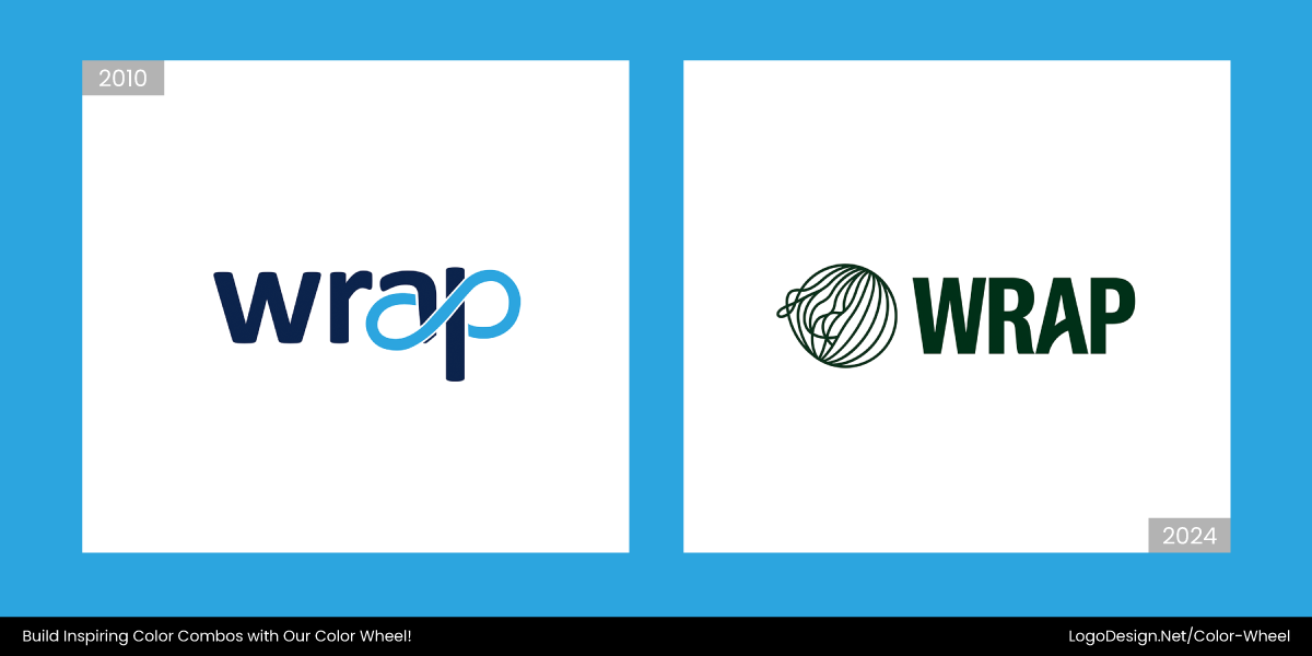
Wrap’s early branding followed the blue-for-tech rulebook. Now, their visual identity uses custom type and warmer hues, showing a pivot to personality over predictability.
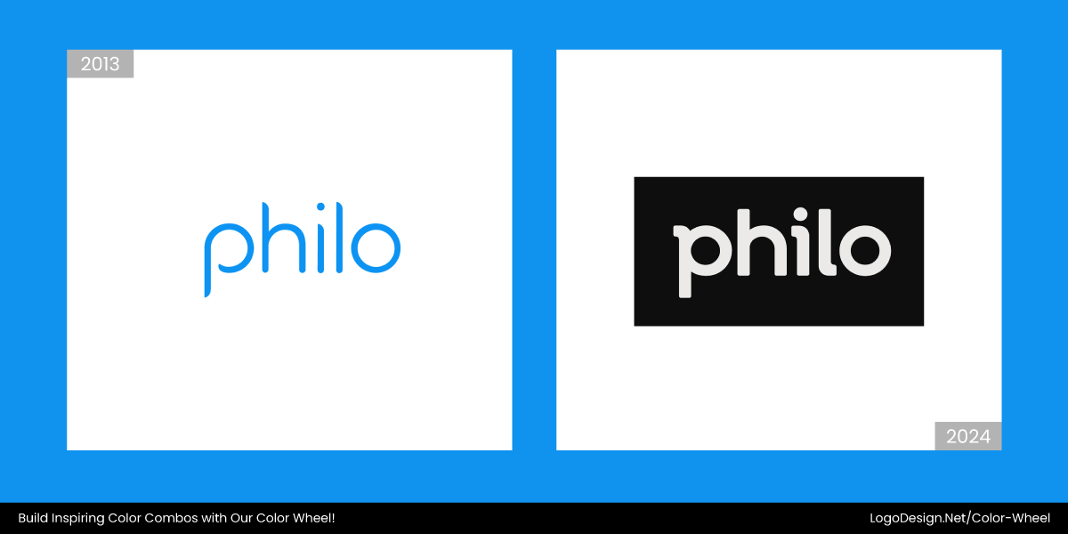
Philo’s pale blue once suggested calm and credibility, but the brand now leans into sleeker, darker visuals that feel more entertainment-forward and less out-of-the-box.
6. Multi-Color Logos
Multi-color logos like eBay, Slack, and even Google do not inspire trends in 2025. Brands are shifting towards a more unified look with monochromatic color palettes. The once-popular rainbow palettes now often feel overly busy and a bit difficult to scale as well.
That’s why many brands have ditched their saturated, multi-color palettes and opted for one that is easy on the eyes.
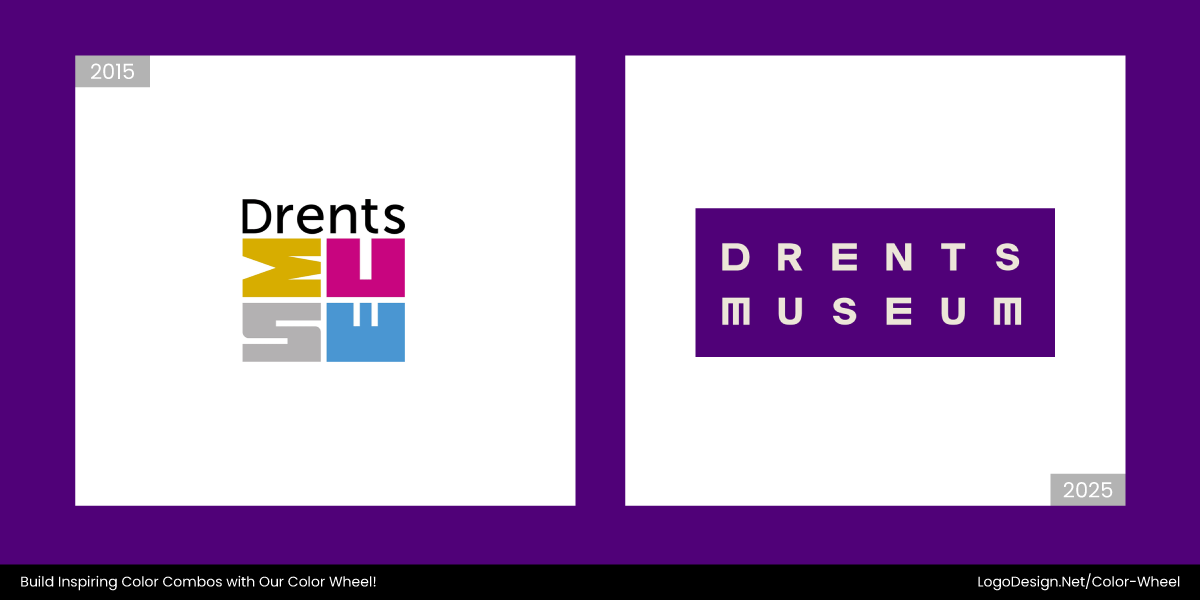
Drents Museum moved away from its lively multicolor logo to a single, refined hue. The goal was to bring more focus and sophistication to its identity while improving scalability.
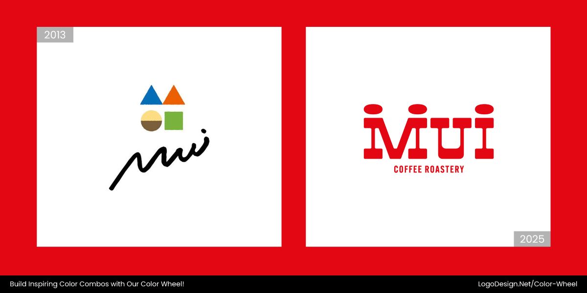
The original MUI Coffee Roastery logo bursted with color and complex lettering. However, the new logo leans into a more grounded, earthy palette that better matches its artisanal, specialty vibe.
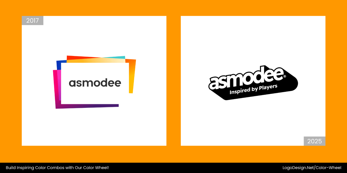
In 2025, the gaming giant Asmodee’s old playful, rainbow-like logo was also replaced with a cleaner, toned-down design. The updated black-and-white logo makes the brand feel more cohesive and mature.
Once full of color, the State Library of Western Australia updated its logo in 2023. Their logo now reflects a modern and minimal aesthetic that favors simplicity and clarity over visual noise.
Pienso ditched its multicolor palette in favor of a smart, subdued color scheme that speaks to tech-savviness while maintaining professionalism.
From bright and bubbly to focused and sleek, Switchboard’s logo went through a major transformation. It now uses a simplified palette with a touch of pink that communicates clarity and innovation more effectively.
Syenex transitioned to a calm and unified palette, leaving behind its multi-color identity. The new logo feels sharper and more scientifically grounded.
7. Watercolor Tones
Pastel blends and artistic, brushstroke aesthetics are beginning to feel dated and less impactful today. In 2025 and onwards, logo designs are adopting bolder, cleaner, and more scalable solutions.
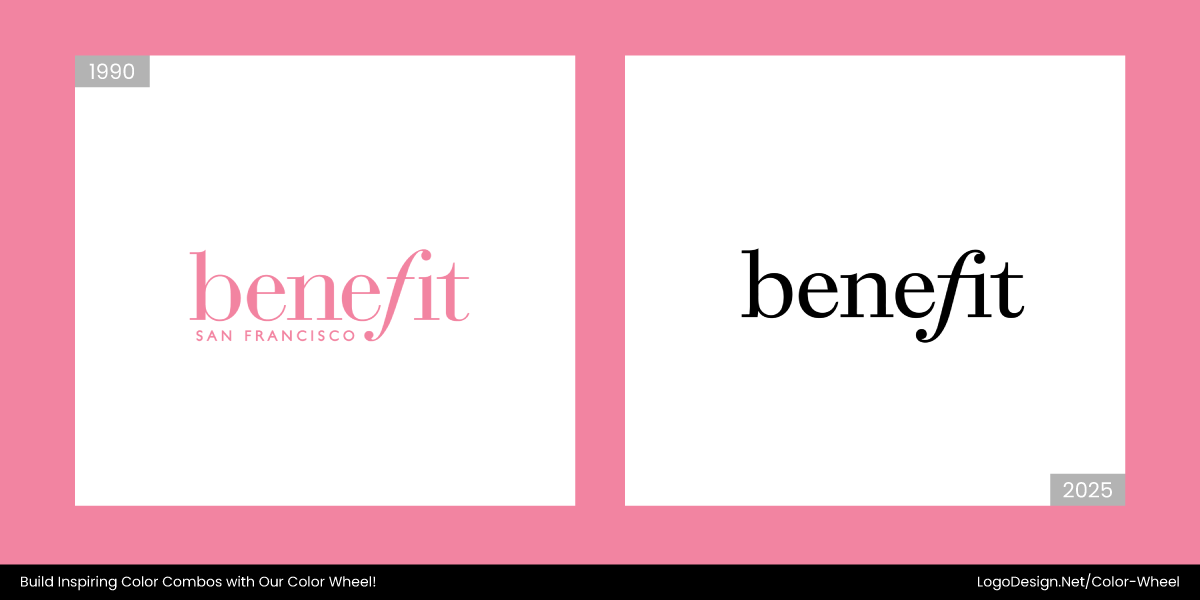
The Benefit logo changed from a soft to a bold and saturated pink in early 2025. Combining this with refined typography creates a playful and expressive brand identity that appeals to a younger audience.
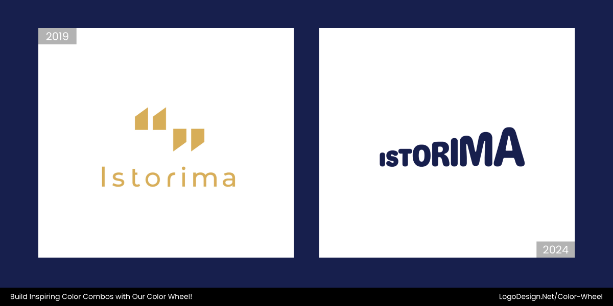
In 2024, the Istorima logo went from muted to vibrant, changing to a high-contrast scheme. Inspired by Greek posters that trigger emotions, the new logo shows cultural values and a refreshed identity.
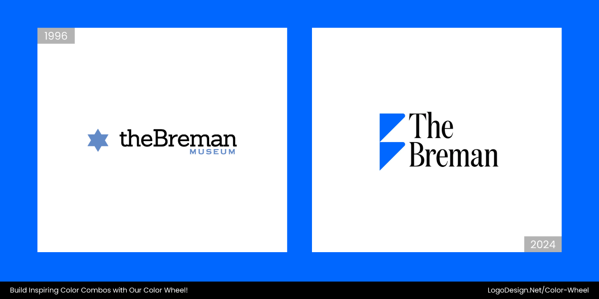
In late 2024, the new Breman logo shows a flat "B" formed by two stacked triangles. This, combined with a deep blue accent and clean layout, gives the logo a minimalist appeal.
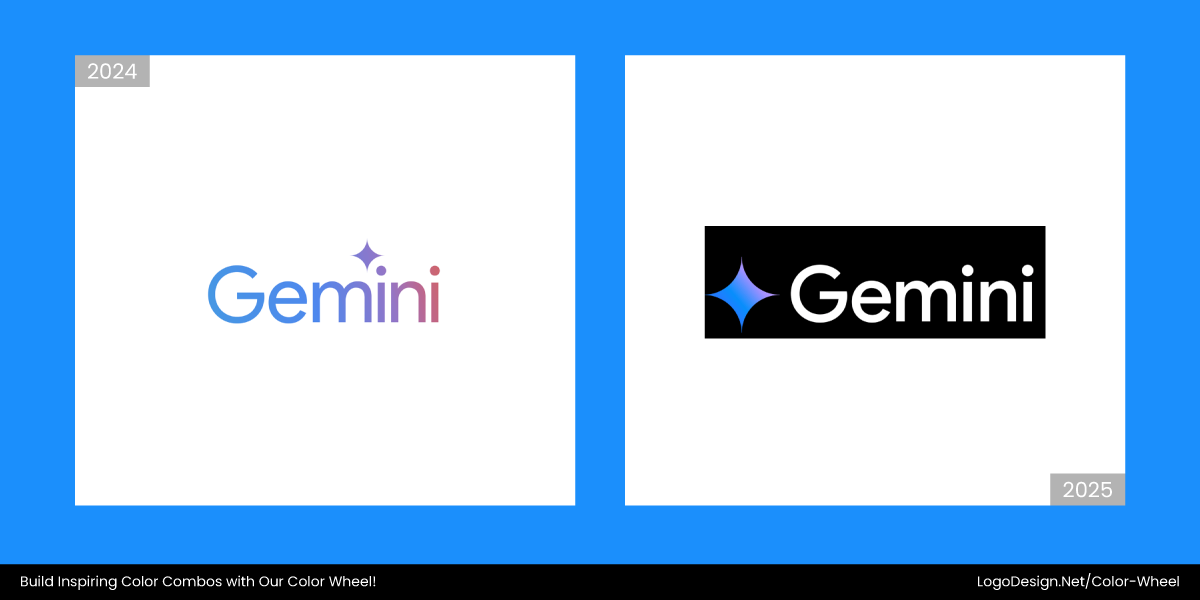
Gemini replaced its logo with Google’s signature four-color palette: blue, red, yellow, and green in 2025. After combining this with the softened star shape, Gemini matched Google’s visual identity that made it instantly recognizable.
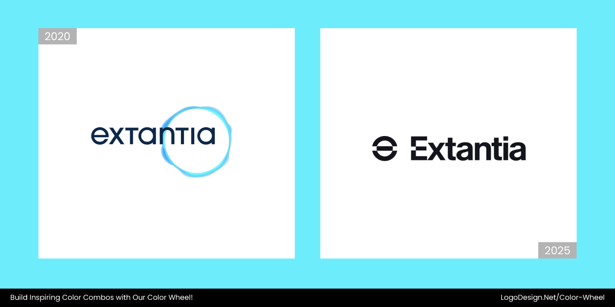
In early 2025, the Extantia logo palette changed from a light to a deep blue. With the "e" symbol separately highlighted, the logo reflects the modern-day aesthetic with a touch of innovation.
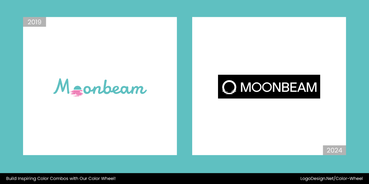
The old Moonbeam logo was replaced by the new one in 2024. It now features a bold palette made with crimson and deep black. The simple yet futuristic typography shows the company’s tech-friendly nature within the Web3 space.
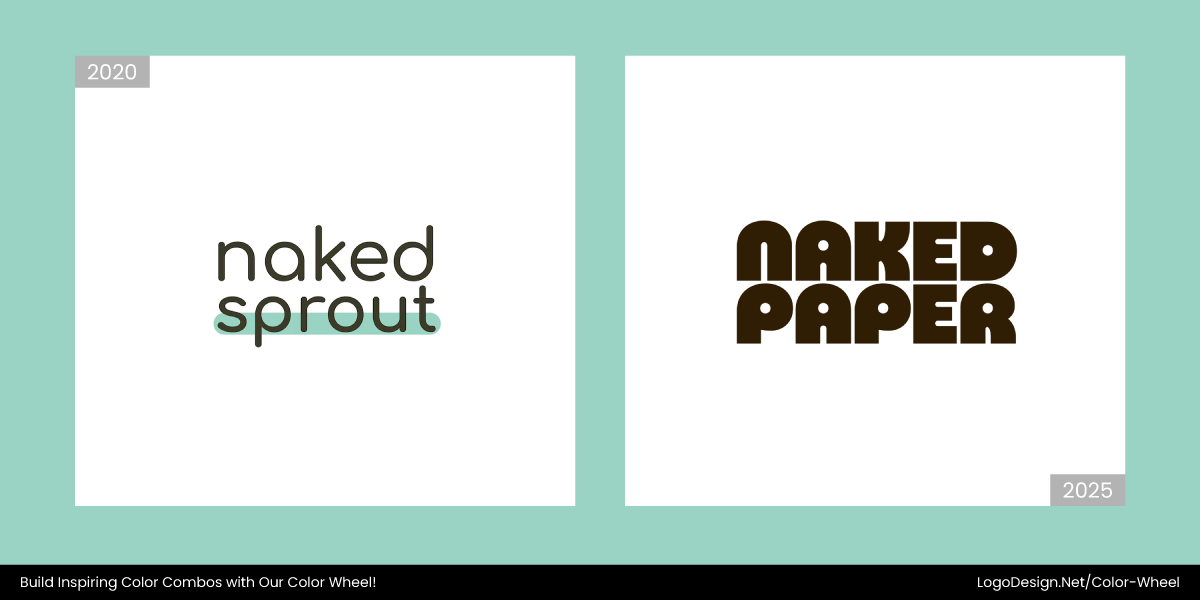
Naked Paper, formerly Naked Sprout, revamped its logo with a warm beige and earthy brown palette. The logo and rounded typography create a minimalistic and eco-friendly visual identity that emphasizes its product quality.
Key Takeaways
- Moss green and earthy hues reflect sustainability and grounded branding.
- Digital lavender and tech pastels bring calm to wellness and digital design.
- Hyper-gradients add movement, depth, and futuristic appeal.
- Desaturated metallics offer modern luxury without the flash.
- Punchy monochromes help indie brands stand out with bold simplicity.
- Stock icons feel overused and dated.
- Oversaturated primaries come off as too corporate and harsh.
- Glossy metallics don’t translate well on screens or feel premium.
- Black-and-white minimalism lacks engagement and personality.
- Default blues for trust are being replaced by warmer, more nuanced tones.
