SALES / SUPPORT : 844-232-4816

How to Make Adobe Illustrator Metallic Logo Designs in Gold, Silver, Copper & Rose Colors
How to Make a Metallic Logo Design – a Step by Step Guide
There are a lot of benefits to choosing a metallic logo for your brand. Your logo looks more professional, catches people’s attention, and it really stands out from the rest. In this tutorial, we have graphic designer Lilah Higgins demonstrating four ways to create your own metallic logo design (gold, silver, copper and rose colors) using Adobe Illustrator. Check out her step-by-step process so that you can follow along and design your own logo:
1. Using Inspiration Photos
2. Groundwork
3. Dividing the Design
4. Light Source and Colors
5. Using the Gradient Tool
6. Final Touches
7. Why Brands Favor Metallic Logos
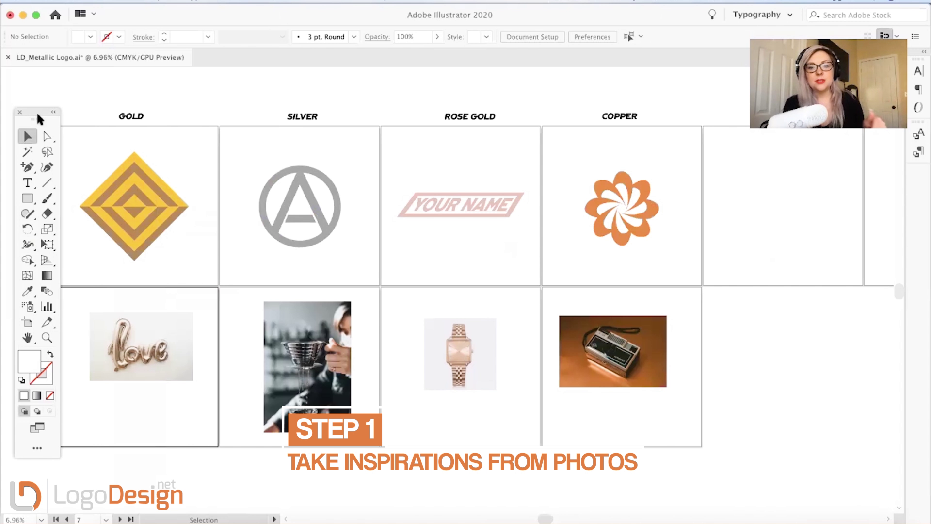
Step One: Using Inspiration Photos

It’s really important to find some inspiration photos so that you can pull out the tones, colors, and the feel of each of these options. Every metal is going to act differently, so make sure that you pull some inspiration photos to see how the different metals react to light, the different ways that it’s going to reflect off of the different things that you see in the photos. This will help in selecting the different shapes for making metallic logos.
Step Two: The Groundwork

First, you want to start with the basics. Create the general shape and colors you want to incorporate into your logo (for gold logos, use yellow/orange - for silver logos, use gray - for rose gold, use light pink - for copper, use orange/red, and so on)..
Step Three: Dividing the Design

Once you’ve picked your inspiration photos, divide the logo designs with metallic colors you made earlier into separate items based on what you have. If you want a background color/shape to create a shadow effect, make sure that it is separate from the rest of your design, so that you can make changes on just that one aspect instead of the entire design.
To separate each shape in your design, tap on the shape building tool > then tap on the shapes you want to be separated.
You don’t have to separate it, depending on what you’re trying to accomplish, just go to your pathfinder if you want to make it all one shape.
Step Four Light Source and Colors

It’s important to decide which elements are separated from one another before you get too far into your design.
You’re also going to want to figure out where you want your light source to come from so that your metal logo is accurate. You will want a gradation going from lightest to darkest, and you’ll want the lightest color to be closest to your light source.
Next, use the color picking tool to take the exact colors you want to use from your inspiration photo, and add them to your design (according to the gradation).
If you decide to use a background color/shape, you are going to want to use a gradation for that as well. It will be opposite of your foreground shapes, so against your lightest shape (the one closest to your light source), you’ll want your darkest background shape and then go down the gradation to the lightest background against your darkest foreground.
Quick Tip: a good way to tell if you’re getting the effect you want is just to zoom out and see if it’s doing what it’s supposed to.
Step Five Using the Gradient Tool

For these metallic logo designs, Lilah is using the freeform gradient tool (tap the gradient tool > at the top, where it says ‘Gradient Type’ you’re going to tap freeform gradient) to get a natural, less manufactured look. She also used the ‘radial gradient’ for her round, copper design (you can get to that by tapping the gradient tool > then where it says ‘Gradient type’ at the top, tap the middle option which says ‘radial gradient’ > lastly, double-tap the gradient tool to easily edit the gradient).
Once you tap on ‘freeform gradient’ and then tap on the shape you want to create a gradation on, little dots will appear, like Lilah has done in the metallic gold logo design. With the dots, space them out to wherever you want your highlight (you can adjust as you go). Next, you’ll want to use the same color that you have in your selected shape, just a lighter shade (maybe even a white) to create the highlight. As you move away from the light source, you don’t want to highlight it as much, so it’ll get darker and darker. You might even want to add a shadowed version on your background, and you would do that by adding a darker color onto the edge of your background shapes. Don’t be afraid to pull other colors or edit the colors you’re creating.
To pull color from an image into your highlight, simply double-tap on one of the dots you’ve created > click the color picker > and grab your color.
If you want a beveled silver logo design, you will have to add shadows, curves, and edges that are not already in the shape.
Quick Tip: Once you’re happy with what you have, copy > paste it somewhere else on your page so that you don’t lose what you have, just in case something goes wrong (so you’ll probably want to do that here).
Step Six: Final Touches

You can add white lines to highlight where the design is popping forward to make it pop a little more. You can decide whether you want it to be geometric or if you want to come in with some natural strokes, it just depends on personal preference and the unique logo design you’re creating. They can also be thicker or thinner, whatever you think is fitting.
You can also add in a drop shadow to give it a subtle pop.
Why Brands Favor Metallic Logos
Want to know which brands favor the shinier, gleaming logos that sparkle in the sunlight and have a glint of their own in the dark?
Though in the recent past, designers and marketers have hugely favored flatter designs and shunned away from skeuomorphism, a design approach championing metallic sheens and other natural-looking graphic imagery, things have changed a lot in the last few years.
All that was old is becoming new again and we see more and more graphic designers experimenting with gradients, geometric shapes, abstract art, and similar forms. While you’ll see the true ‘arrival’ of metallic logos on the design scene in the work of younger designers, there are those multimillion-dollar brands and companies that have been rocking a solid metallic logo design for quite a long time.
These brands disproportionately consist of automobile logos from names such as Datsun, Nissan, and Mercedes-Benz than any other industry. Perhaps because they want to take advantage of the sunlight as it reflects brightly against their shiny 3D logos. However, there are still many brands such as Guinness and Super Bowl that aren’t related to cars but sport a metallic logo brilliantly.
Mercedes-Benz Logo
Mercedes-Benz has a classic silver logo design, with a sheen that adds the desired pop to the design but prevents it from looking gaudy. The design is all angles and very simple and professional. For some reason, it makes you think that if it were just a regular, plain gray, it would have fallen flat on its face. With the silver sheen, the simple gray becomes elevated.
Pro tip: Taking inspiration from Mercedes-Benz’s simple approach to metallic logo design, instead of doing too much with your shadows and gradients, keep it simple and to-the-point.
Super Bowl Logo
Super Bowl’s latest silver logo example is a combination of flat and metallic work. While the brand name appears in flat colors, the silver-gray pictorial is composed of the kind of silver metallic that looks more like liquid moonlight.
The shadow work, gradients, and highlights are absolutely flawless in this metallic logo. Through so many of its curves, everywhere the light touches the trophy the execution of design is watertight. If we’re being completely honest, it looks crafted more in a workshop by hand than in a design studio using some software and that is the hallmark of great logo design.
Pro tip: Study your subject in minute detail when you are designing a metallic logo. Considering its size and space, look how light treats its different parts so you can execute it perfectly.
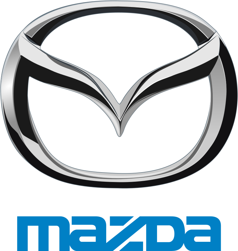
Mazda Logo
Mazda’s metallic logo is the kind that’ll make you go blind if you look directly at it in the sunlight. Imagine the kind of brilliant light it’ll reflect as the car zooms past you in the bright beams of the sun.
Mazda’s is a stunning car logo example with a combination of black and gray and both colors have been treated with the metallic application. The addition of black makes the logo look like a fashion statement. It’s simple yet sophisticated, and the uncommon shape makes the logo look more attractive than perhaps any on the list.
Pro tip: If you want your whole logo to have metallic appeal, use a shape/structure that can handle the extra treatment.
Guinness
Guinness’ is a classic beer logo that uses the gold and black combination in its design. If you’re looking for metallic sheen, you won’t find it here. In this logo, the metallic application is more rugged, making you think of cowboy boots, the golden froth of its beer, and an old-timey bar.
A lot of this nostalgia is achieved by using a shade of gold that speaks of old gold coins rather than the shine of new notes. The rusty metallic look is concluded by using a to-the-point Serif font.
Pro tip: Experiment with different shades of gold in your metallic logo designs – the gleaming shine is not the only way to go.
NLL
NLL’s logo uses silver and black for its metallic representation. Black is a rich enough color that absorbs any extra light that your silver sheen maybe shedding. If you want a metallic logo but don’t want it to shine too much – you know, a more understated look – this is your inspiration right here. Plus you got to love how it represents the shadows in two different ways (right and left) in the single design.
Pro tip: Balance your shiny metallic designs with colors that can offset the shine if it becomes too much.
Wrapping Up
Phew! So there you have a detailed discussion on what are metallic logos, how you can make one, and what different brands feature metallic designs in their logos. If you have any feedback, feel free to use the comments section, and let us know which style of logo design you would like to know about next.
Till then, stay home and stay safe.
This article has been reviewed and verified by Zaheer Dodhia, an expert in logo design and branding.
Article by Lilah Higgins, Graphic Designer and Illustrator
Lilah Higgins is a designer, illustrator, and artist currently based in Northwestern Wyoming. Taking her fine art training and strategic mind into the online space, she helps clients brand cohesively and effectively across platforms, bringing them the confidence they need to become industry leaders. You can find more about her and her work at www.lilahhiggins.com.


